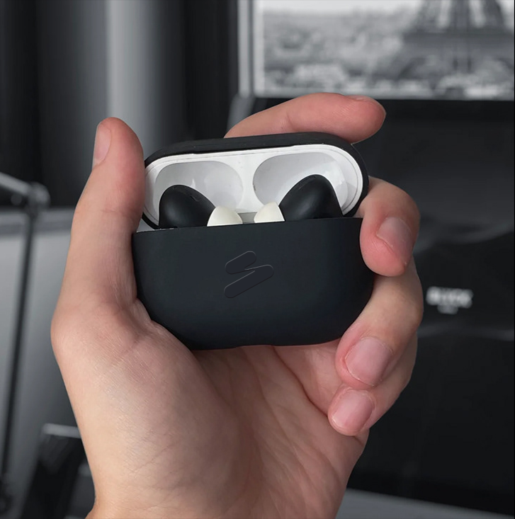
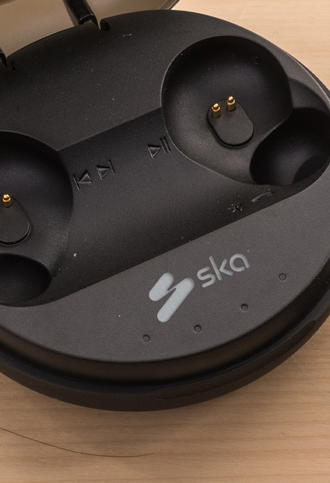
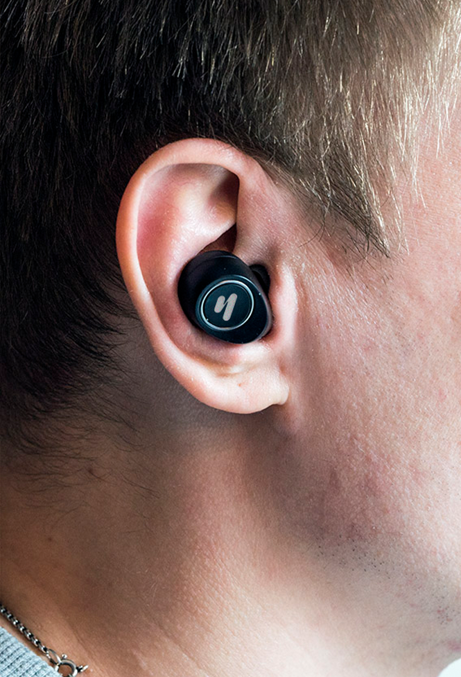
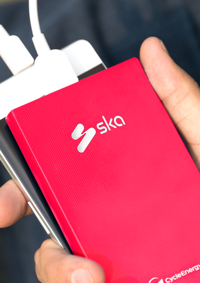
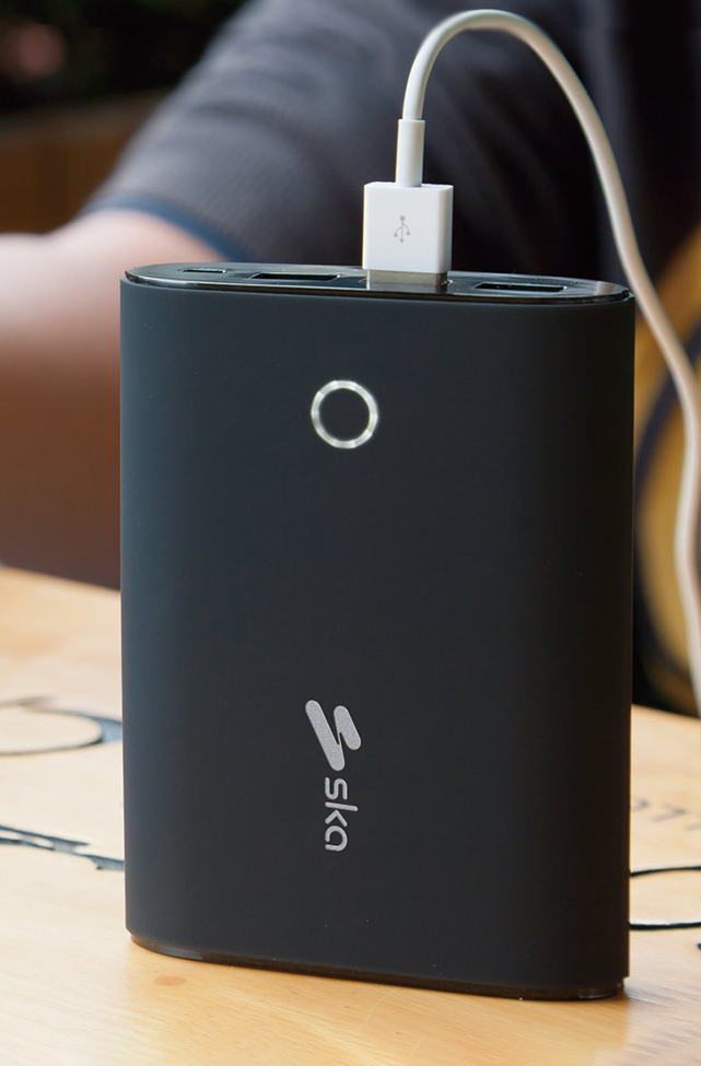
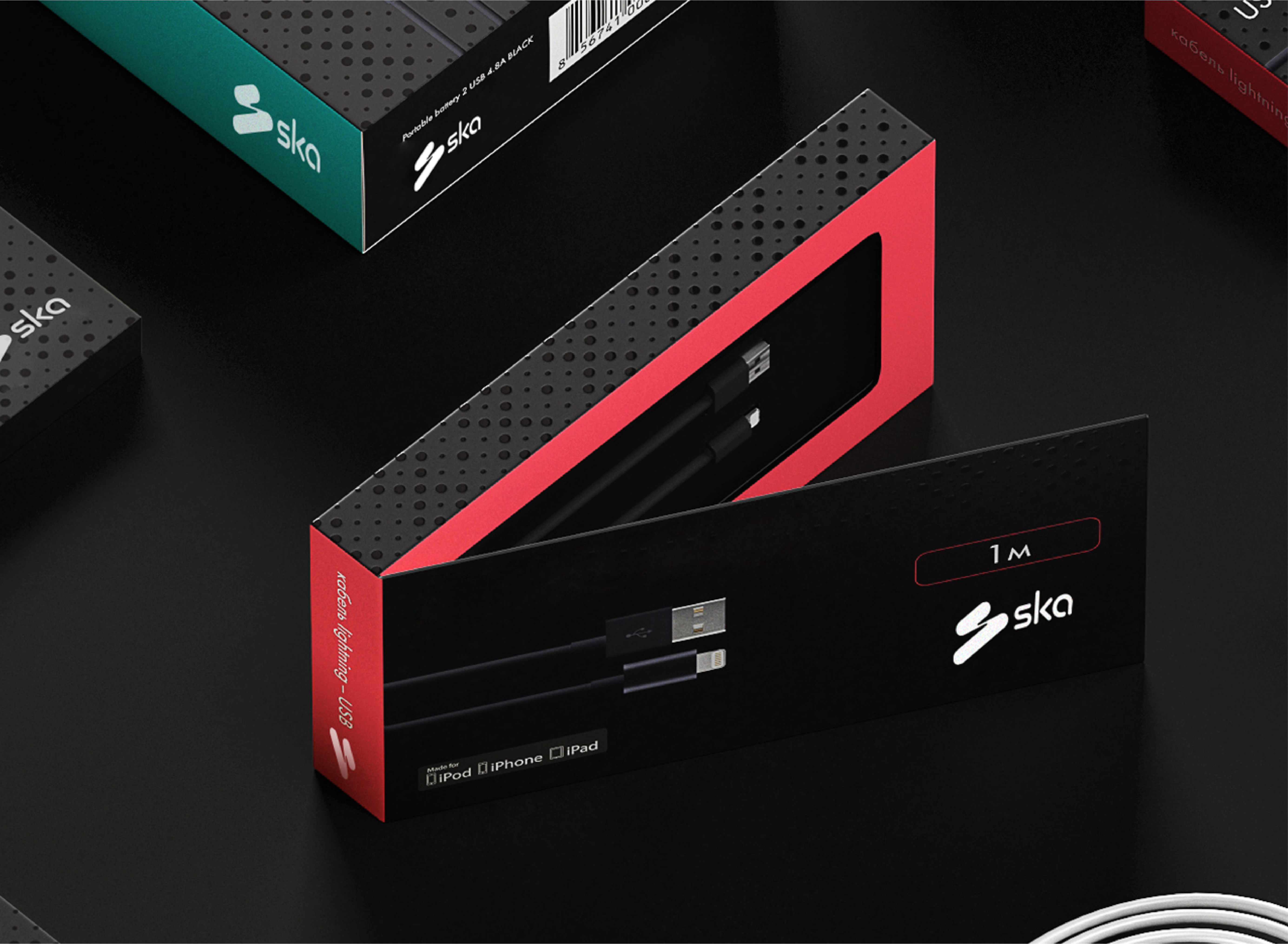
SKA, is a GCC-born mobile accessory and connectivity brand which has been inspired by the upbeat and offbeat musical genre. The product range comprises power banks, water-resistant bluetooth speakers, wireless earphones, smart wearables, chargers and plenty of more portable devices that prove to be your powerful companions especially while on the move. Every product is carefully crafted following years of technical expertise and extensive market research.

Mobile accessory, electronic, and tech brands are plenty, but nobody does it like SKA. The brand is driven by more power, more features, more options – ensuring that every consumer gets something more with every product. Apart from highlighting the ‘more for sure’ factor, SKA also wants to be known as a brand that enhances productivity. In a world driven by tech, we are all seeking the best tools with long battery lives, better durability, and so much more that’ll help us stay connected and be productive, anywhere, anytime! Being relatively new in the market, SKA wished to be recognised and on par with competitive brands that are leading in the segment.
After getting the know the brand and its show-runners, we developed a clear, united brand purpose—’creating beautiful moments and opportunities through food’. This statement captures the brand’s raison d’etre: making beautiful and memorable experiences while opening the doors of opportunity for entrepreneurs. While they were already living their team values, it was important to articulate them. As the brand expands, their principles remain the same.
On the design side, we created a powerful visual identity to appeal to the international audience. We reimagined their logo, choosing to go minimal, minus the Asian fonts and usual design
elements to avoid becoming ‘not just another Japanese food joint’.