Aug 20, 2025
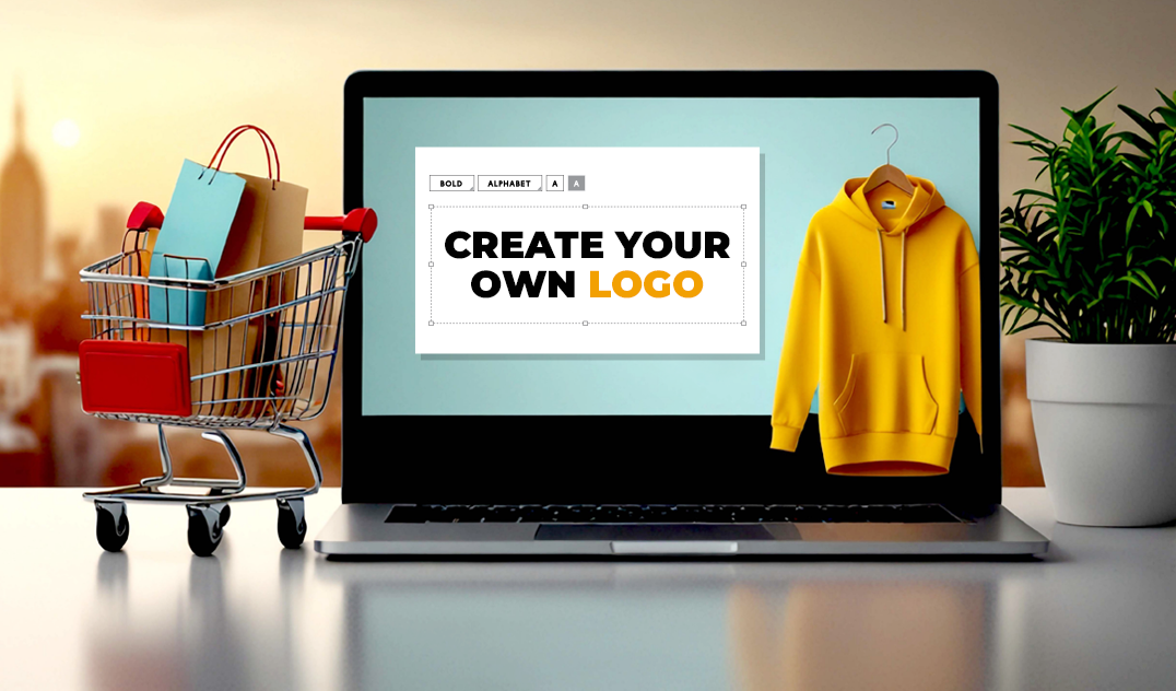
As today’s online shopping network is vibrant and fiercely competitive, having a strong and memorable e-commerce logo is very crucial. Your logo is the first impression shoppers will have of your brand, shaping the entire online shopping experience and playing a pivotal role in developing brand recognition and trust.
With a well-crafted e-commerce logo design, you can boost trust, attract the right audience, and also make your brand be in retrospect. In this blog, we can discuss eight inspiring e-commerce logo examples from global giants to niche local stores, which show how thoughtful design influences the e-commerce experience. In addition to that, you can find practical, actionable tips on creating a logo for your e-commerce brand that can stand out and resonate with your audience.
Branding stands as the foundation for a successful e-commerce. Your logo will be a visual ambassador that encapsulates your company’s values, tone, and promise to customers. In the sprawling online shopping network, a well-created e-commerce logo design can boost trust, help customers to easily recognize your brand, and enhance the overall e-commerce experience.
When a consumer sees a professional, relatable logo, they are more likely to feel confident in your brand and services. This trust can be translated into higher conversions, repeat business, and stronger word-of-mouth marketing. Your logo is not just an image; it is the fundamental part of your brand identity and customer relationship.
Logo Description: Amazon’s logo has a feature that is a clean black wordmark with a radiant orange arrow that forms like a smile connecting the “A” to the “Z”.
Why It Works: The arrow shows the brand’s wide product range “from A to Z” while doubling as a smile, which emphasizes Amazon’s focus on customer satisfaction in the online shopping experience. The design is minimalist and has clear typography, which makes it highly adaptable across all platforms.
Takeaway: Combine symbolism with simplicity to convey your brand’s promise emotionally and visually.

Logo Description: Etsy’s logo has a serif font in a single-color design, which shows handcrafted authenticity.
Why It Works: The serif font syncs in professionalism with a personal, artisanal feel, which is ideal for an online marketplace that focuses on handmade and unique items. Its straightforward design can support quick recognition.
Takeaway: Choose typography that aligns with your brand’s personality, whether that’s sophistication, creativity, or tradition.

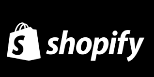
Logo Description: Shopify combines a modern, sans-serif wordmark with a minimalist shopping bag icon.
Why It Works: The logo balances professionalism and an approachable vibe, and it perfectly resonates with the role of empowering entrepreneurs in e-commerce. The icon is very simple yet distinctive, reinforcing the e-commerce theme.
Takeaway: Pair wordmarks with symbols that reinforce your business niche to strengthen brand identity.
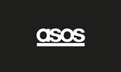
Logo Description: ASOS has tightly spaced uppercase letters in bold, with a modern sans-serif font.
Why It Works: The typography style shows pace, energy, and advanced fashion elements, which makes it adaptable across all digital and print platforms. It can communicate the brand’s youthfulness, trendy nature clearly.
Takeaway: Let your font choice express your brand’s core values and the target audience’s lifestyle.
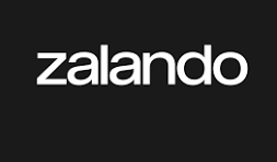
Logo Description: Zalando’s refreshed logo features a vibrant orange color with a custom, accessible font and a simple triangular symbol.
Why It Works: The orange evokes energy and enthusiasm, while the sleek, modern font enhances readability and inclusivity. The triangle reflects forward-thinking and progressiveness, key in the fashion lifestyle market.
Takeaway: Use color psychology wisely and combine it with unique visual elements to stand out.
Logo Description: Flipkart sports a vibrant yellow shopping bag symbol accompanied by a clean, modern font named Riona.
Why It Works: The yellow conveys friendliness and optimism, while the shopping bag icon emphasizes freedom of choice in online shopping. The font is contemporary yet appealing to a broad audience.
Takeaway: Colors and icons should reinforce your brand’s promise and accessibility across devices.

Logo Description: Made.com uses a minimalist wordmark with sharp, elegant lines and geometric precision.
Why It Works: The logo conveys high quality and modern design, mirroring its focus on stylish, affordable furniture. Its aesthetically pleasing simplicity works well for a design-savvy audience.
Takeaway: Minimalist designs can communicate luxury and refinement effectively.

Logo Description: Noon’s logo features two main components: a bold, semi-circle icon alongside an arched wordmark. Its vibrant yellow color (widely known as “Noon Gold”) is offset with dark gray and light gray accents to balance warmth with contemporary simplicity. The logo’s geometric form and open, rounded typography exude friendliness, accessibility, and a solid digital feel.
Why It Works: Translated from the literal meaning of “noon”, the coming and going of light, the logo embodies hope and illumination. The color scheme of Noon is bold in the saturated online shopping market, serving to further promote recognition among Middle Eastern customers. The unified, recognizable design of the logo makes it easy to suitably accommodate app icons, banners, and mobile screens, guaranteeing a uniform online shopping experience.
Takeaway: Employ bold, simple forms and a clear color scheme to generate a logo that’s both easily recognizable and inviting. Drawing inspiration from your brand’s essential meaning or value, such as the “noon” idea, can result in enduring, meaningful visual symbolism.
Minimalist vs. Illustrative Styles: Minimalist logos use clean lines and simpler shapes for a timeless appeal and high adaptability. Illustrative logos can add a touch of personality and storytelling, but they can get complex on smaller screens.
Wordmarks vs. Symbols: Wordmarks emphasize typography and clarity of brand name, while symbols produce instant visual recognition. The blending of both can be particularly powerful.
Color Psychology for Online Shopping: Colors stir up feelings, blue evokes trust, orange inspires enthusiasm, green inspires health and tranquility, and yellow gives friendliness.
Fonts that Express Trust and Innovation: Sans-serif fonts give a sense of being current and open; serif fonts can imply tradition and dependability. Use fonts readable across platforms.
Applying the most effective logo design concepts for e-commerce websites involves striking a balance between form and function for a smooth e-commerce logo design that will appeal to your audience.
Your e-commerce logos are more than just a graphic design; it is a fundamental element of your branding, which can shape customers’ perception and transcend your online shopping experience. Understanding iconic brands and applying their best practices on how to design a professional e-commerce logo and how to create a logo for your e-commerce brand can empower your business and stand out in a crowded marketplace.
Investing time and thought into your logo design can connect your audience to a more memorable, trustworthy brand experience. Which can ultimately contribute to a smoother and more enjoyable shopping experience. And Moonbox can be your partner in creating stunning logos, which can make your brand stand out.