Feb 10, 2022
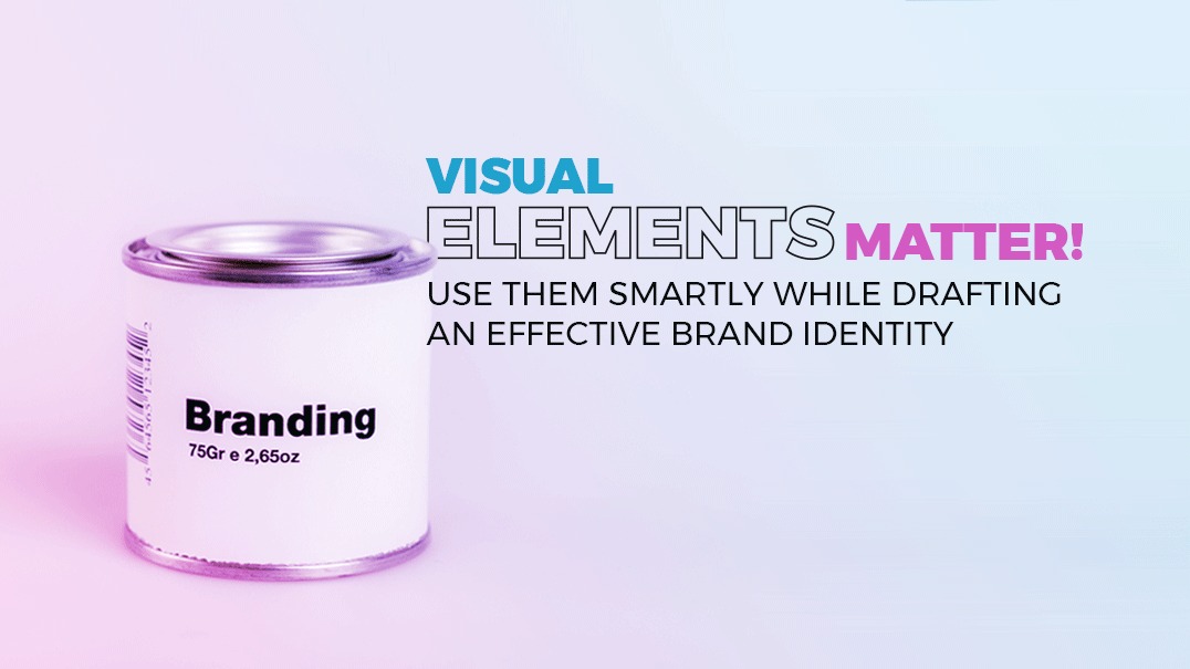
Read before you choose the visual elements for your branding
About a year ago, one of our prospective clients approached us and said:
“We have to launch next week. We can’t delay. Let’s start with the current branding ideas, and we will keep changing things as we move forward.”
We could not allow that to happen because branding is not a one-off thing that should be changed every now and then. It is one of the key aspects of your business, it gives your business an identity that people will associate with for a long period of time, if not for life.
The main reason for sticking to one brand identity is to strengthen brand recognition among customers. Changing it often would destroy the true purpose of the branding process. Therefore, it is crucial to properly plan and carefully choose every aspect of your branding process.
How do you think our team responded?
Of course, we couldn’t turn them down! This was a big project. Our team arranged a meeting with the client and explained to them the whole scenario and how this could be a disaster.
Visual elements help generate emotion and establish a connection with your audience, reinforcing the power of your brand in their mind.
Let us have a look at some of the key visual elements that businesses have to consider while drafting an effective brand identity:
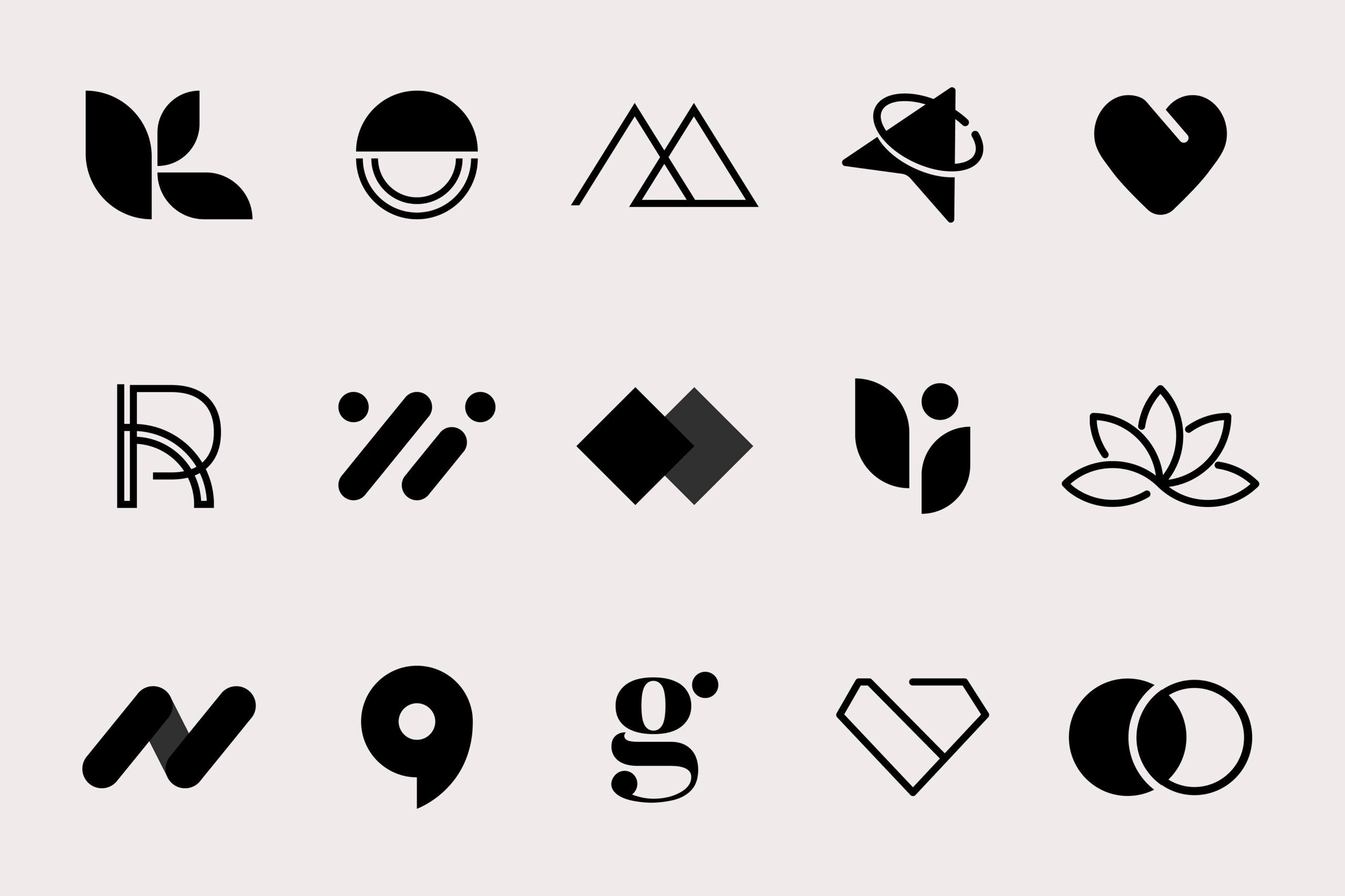
Your logo becomes the visual representation of your brand, and it is engraved on, literally, everything! You might have to go through several changes to get that final logo that best represents your brand and all that it stands for. But when you do, it will be totally worth it!
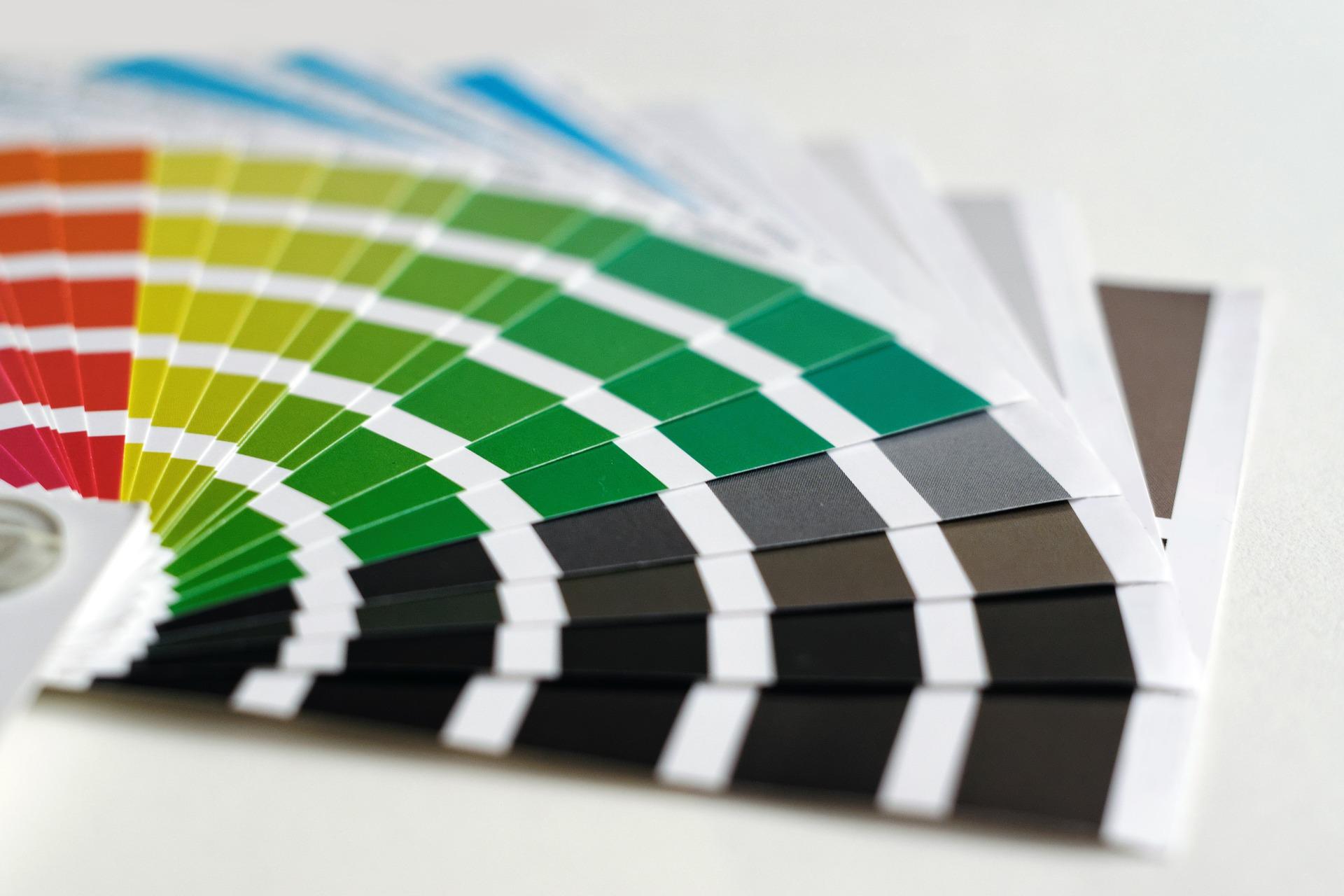
Choose colors that reflect the personality of a brand. For example, you may want to select bright colors when you open a toy store, but you need to pick highly sophisticated colours while selling cosmetics.
It is also better to choose only a few colors and use them throughout your logo, images, designs, and even texts. Moreover, this strategy also helps in building brand recognition. Doesn’t “red” come to your mind when you hear “Air Arabia”? ‘’Apple’’ is associated with its iconic black and white colors, and ‘’McDonald’s’’ for its famous yellow arc.
Studies show that when audiences see a logo repeatedly, they are able to recognise the brand basis the color palette without even seeing the name.
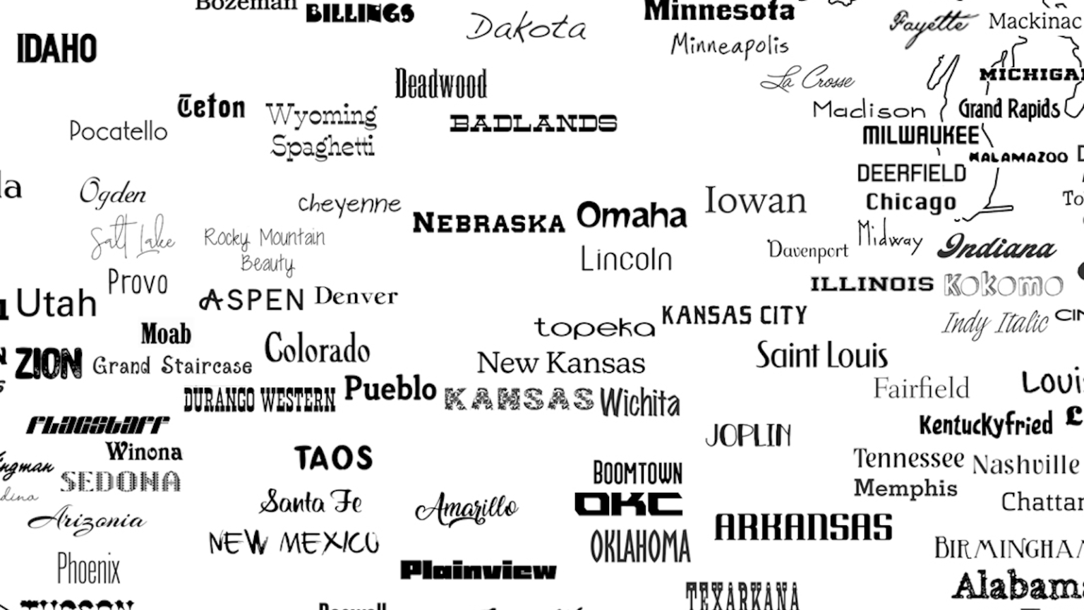
This is a fancy term for “Fonts”! Just like colors, you need to pick your fonts carefully because they affect how your audience perceives your brand. For instance, for a toy store, you can select fonts like Gill Sans, but you have to be very selective while picking a font for a cosmetic brand. An elegant font like Playfair Display or Sans Serif is a suitable option for such a business.
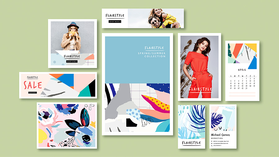
Just like all the aspects discussed above, the images you use must align with the theme of your brand. A sophisticated monotone image with a backdrop of London Street will look out of place on a blog of your toy store’s website. However, the same might look just right on a fashion or lifestyle website.
With all this settled, the last thing that you have to focus on is the layout and whether it aligns with the whole branding strategy or not.
That’s it! You are all set and ready to go!
If you are wondering about the project, we still got it! However, it was a mammoth task for our A-team to complete the project before its launch.