Sep 30, 2021
About a year ago, one of the prospective clients approached us and said:
“We have to launch next week. We can’t delay. Let’s start with the current branding ideas, and we will keep changing things as we move forward.”
We could not allow that to happen because branding is not a one-off thing that you can change every now and then. It is rather one of the key aspects of your business that have to remain the same for several years, if not for life. The main reason for sticking to one brand identity is to strengthen brand recognition among customers. Changing it time and again would destroy the whole purpose of the branding process. Therefore, it is crucial to properly plan and selectively choose every aspect of your branding process.
What do you think was the response of our team?
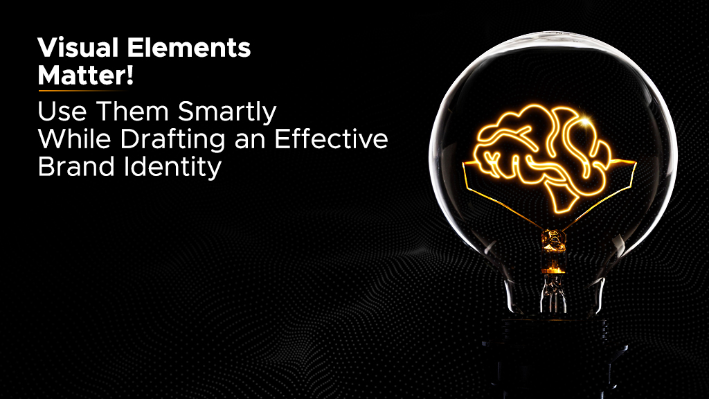
Of course, we could not deny it! This was a big project. Our team arranged a meeting with the client and explained to them the whole scenario and how this could be a disaster. Let us have a look at some of the key visual elements that businesses have to consider while drafting an effective brand identity:
Your logo becomes the visual representation of your brand, and it is engraved on, literally, everything! You might have to go through several changes to get that one logo that best represents your brand and all that it stands for, but it will be totally worth it!
Choose the colors that reflect the personality of a brand. For example, you would like to select bright colors when you open a toy store, but you need to pick highly sophisticated colors while selling cosmetics. It is also better to choose only a few colors and use them throughout their logo, images, designs, and even texts. Moreover, this strategy also helps in building brand recognition. Won’t “red” come to your mind when you hear “Air Arabia”?
It is a fancy term for “Fonts”! Just like the colors, you need to pick your fonts carefully because it affects how the audience perceives your brand. Again, for a toy store, you can select fonts like Comic Sans, but you have to be very selective while picking a font for a Cosmetic brand.
Just like all the aspects discussed above, the images you use must align with the whole theme of your brand. A sophisticated monotone image with a backdrop of London Street will not look good in a blog of your Toy Store’s website. However, the same might look great on a business website. With all this settled, the last thing that you have to focus on is the layout and whether it aligns with the whole branding strategy or not. That’s it! You are all settled and good to go! If you are wondering about the project, we still got it! However, our team of superhumans had to put up a lot of extra effort to complete the project before its launch.
Need help with your branding? We are just a message away!