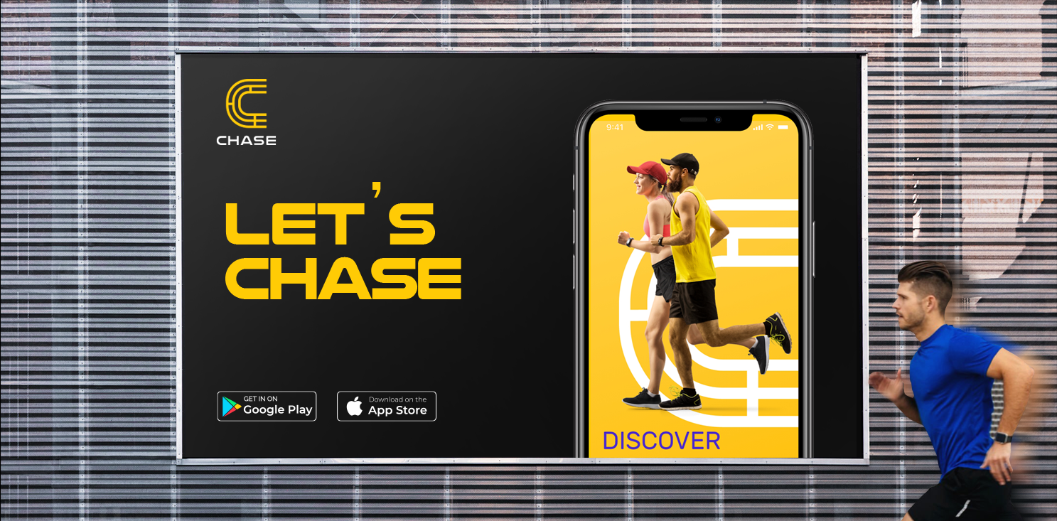
Chase is a KSA based fitness app that encourages people in and around the country to adopt a healthier lifestyle by working out regularly while making new friends who have the same fitness goals. Chase wants to be more than just a fitness app – it wants to build a community where fitness is synonymous with friendship.

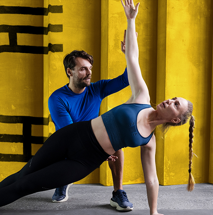
Most often, fitness is serious business. Strict diets, strict workouts, and moreover, strict routines that make fitness monotonous. But not Chase. Among the plethora of fitness apps already in the market, Chase wanted to go beyond fitness and become an inspiration to communities that enjoyed sports, workouts, and activity. It wants to make fitness fun, bring people closer, bring about joy and enthusiasm, and these fun elements had to be brought to light instantly with its new name and identity. Our challenge lay in creating a brand from scratch which was nothing like other global fitness apps that competed in the same market.
We kicked off the project with a naming process, understanding the importance of giving the brand a short, simple, name that the locals could resonate with. In the near future, with plans to go global, the name should appeal to a wider audience too.
We explored various directions, brainstormed, created an extensive list, shortlisted names and finally picked one that defined the brand well. Thus, we came up with ‘Chase’ which extends to different aspects of life like chasing your fitness goals, your dreams, and literally – to run around or chase something. Chase was crisp, clear, memorable, meaningful, easy, and looked great as a name for a fitness app, thereby ticking off all our considerations.
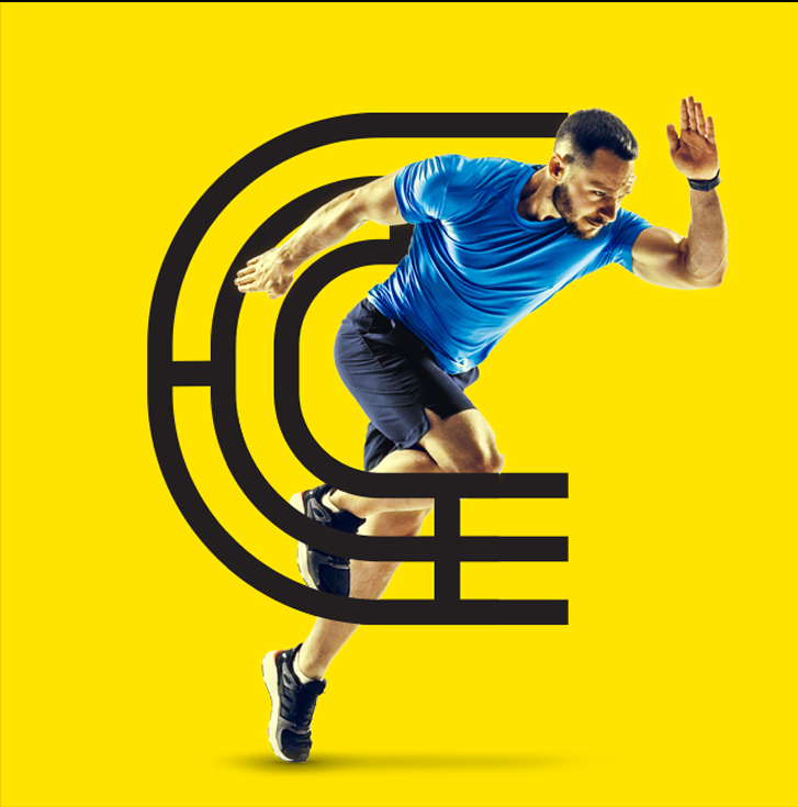
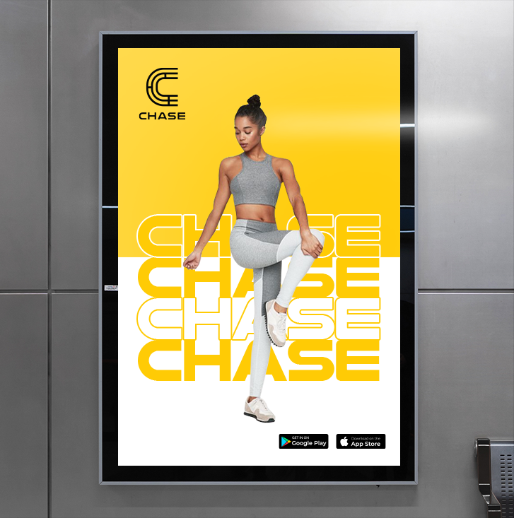
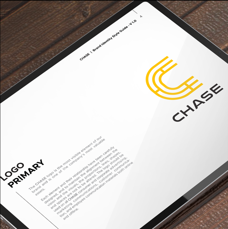
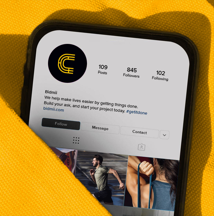
Once we zeroed in on a name, our next step was to design a logo that would become the brand’s identity. As a name, Chase was simple, so we ensured that its logo mark had a rationale that was equally simple. If you look closely at the logo, you’d notice a ‘C’, the first letter of the word ‘Chase’. The concentric rings around the C remind you of a target or a goal, which is what workouts and fitness are all about – achieving our goals. The horizontal lines between the rings resemble the demarcations on running tracks, which strengthens the point of the app – running to chase our goals and get fitter. To bring it all together we chose a bright yellow tone. Yellow signifies optimism, energy, joy, happiness and friendship – everything that Chase stands for too.
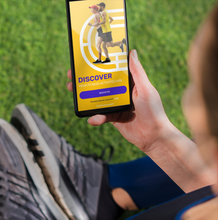
Creating something from scratch always has its perks. We were a part of the Chase journey since its inception and we ensured that everything fell into place perfectly, bringing about the right emotion that the brand wants to convey. Right from understanding the essence of the brand, to naming it, giving it a vibrant identity, and now, building its mobile application, we have continually been a part of bringing Chase to life.