Miro-tech
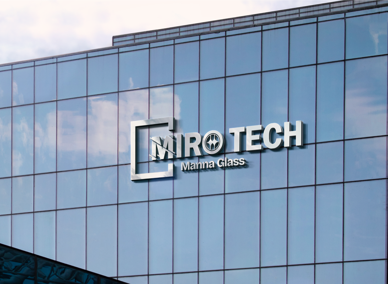
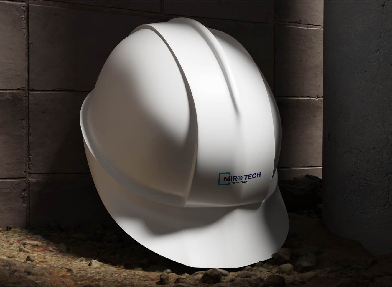
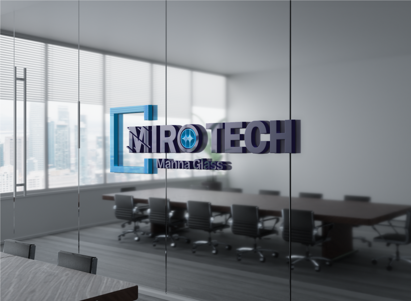
Miro-tech is a forward-looking company with strong technical potential, but its brand identity needed greater clarity and consistency to reflect its ambitions more effectively. While the business had a solid foundation, the absence of a defined visual system made it difficult to present the brand in a way that felt cohesive, credible, and aligned with its market positioning. The challenge was to create an identity that felt modern, professional, and scalable, while staying true to the client’s vision.
Moonbox supported Mirotech through the development of a refined logo and a structured set of brand guidelines designed to bring consistency and long-term usability to the brand. The focus was on creating a visual identity that was clean, adaptable, and reflective of the company’s forward-thinking nature, while remaining aligned with the client’s vision. The result is a stronger and more cohesive brand foundation that enables Mirotech to communicate with greater confidence and maintain consistency across future applications.