Dec 7, 2023
A design or photograph’s success depends on the use of balance, color, and other compositional elements. Combining text, photos, and abstract shapes into a single design poses the challenge of bringing a sense of harmony and cohesion. So how is the rule of thirds used in Design? By using the rule of thirds in design, designers, artists, and photographers can create a more balanced composition while directing the viewer’s attention to important elements.
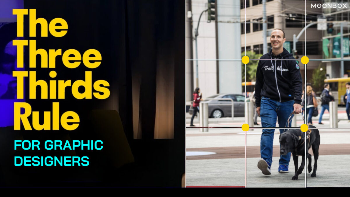
By creating a grid of three columns wide and three rows tall, the rule of thirds divides up a design or photo into thirds. For designers and photographers, grid layouts are frequently used as guidelines; graphic designers can use them as a way to align text, position photos, and generally arrange all the elements in a way to make it easier for the viewer to ingest the information (like reading a book) by dividing it up into evenly-spaced rows and columns. Similarly, visualizing a grid over the picture helps direct attention and focus so the viewer does not feel lost.
Using the rule of thirds in design, the lines meet at four “intersections” at the center of the page that correspond to the scene’s primary focal points. This asymmetry (of using the odd number 3 instead of 4 rows and columns) creates just enough tension to create a dynamic sense of flow to the piece.
It should be noted that this is more of a guideline than a rule. If you want to design well, your intuition should always guide you more than any hard-and-fast rules. In order to ensure that your focus is directed for the best visual impact, many people recommend keeping a mental image of this 3 x 3 grid.
Here we will delve into on how is the rule of thirds used in design?. The concepts of “asymmetry” and “balance” are not mutually exclusive in composition. Perfectly symmetrical photographs have a strong sense of balance – but they sacrifice flow and movement. Symbols of symmetry suggest stasis, rigidity, and even confrontation, as symmetrical figures (or scenes) seem to “stare you down” and stand firmly in place. You can experiment by adding elements on the other side of the page that may give your composition a pleasing counterbalance by pushing your subject towards one side or the other.
As a guidepost for your content, the central intersections of the rule of thirds eliminate the guesswork of composition. A viewer will naturally land on the subject if at least one of the four central intersections (or guiding lines) aligns closely with it.
In web design, you can use the rule of thirds by placing a call-to-action button or other key element in one of these sweet pots, since the eye naturally falls upon the four intersection points.
Also read more on Graphic Design Services – Turning Your Marketing ideas Into Reality
It is common for non-designers and junior designers to think that great design is symmetrical. It must look good if everything is symmetrical and feels right! However, that isn’t the case.
We are naturally drawn to contrasting elements. It oozes depth, layers, and uniqueness thanks to imperfectly designed elements.
In creating asymmetrically beautiful layouts, the rule of thirds is deceptively simple. It would look too low if you hung a picture frame perfectly centered on a living room wall. We anchor a frame higher than we normally would, so that our eyes can gaze into the center of the art. By playing to the room’s height, the art creates a sense of balance.
When we use the rule of thirds in our designs, the same thing happens. The rule of thirds helps us create a sense of visual hierarchy and avoid the tendency to center everything perfectly so that our eyes know what to look at first.
Explore more on Top 5 Go-to Websites for Graphic Designers
Create the rule of thirds grid by drawing three lines that are evenly spaced vertically and horizontally. The result will be three columns, three rows, and four intersecting points.
Most design software allows you to create this grid, or you can enable grid view in your camera settings. On the iPhone, you can activate a grid based on the rule of thirds (Settings > Camera > Composition > Grid).
I’m glad to help. Now that you have a rule of thirds grid, you can use it.
“In the blink of an eye” refers to the human eye, which is the fastest muscle in the body. Every second, it can focus on 50 different objects. In order to keep us safe, our eyes constantly scan, process, and store information.
As a result, it’s difficult to design with the expectation that someone will find what we want them to see, without our involvement. Here is where the rule of thirds grid comes into play.
The eyes are constantly moving around looking for elements to latch on to when we read, see art, or watch a movie. The field of view can be given visual priority.
Before applying the grid in your work, think about what your design or artwork is about.
You need to pay attention to every element of your design. To make sure it shouts louder than everything else, pick the most important one and align it to the grid.
If your page has 10 elements, order them by priority. It is impossible to have 10 elements with priority, so choose the most important element.
In the vast landscape of graphic design services in Dubai, selecting the ideal company can be a daunting task. A key strategy for assessing a graphic design agency is to carefully examine their portfolio and determine if it aligns with the type of work you are seeking. Additionally, it is crucial to evaluate whether the agency possesses experience in handling projects similar to the one you have in mind. For tailored graphic design services in Dubai, it is advisable to choose an agency that has successfully executed comparable projects in the past.