Apr 4, 2023
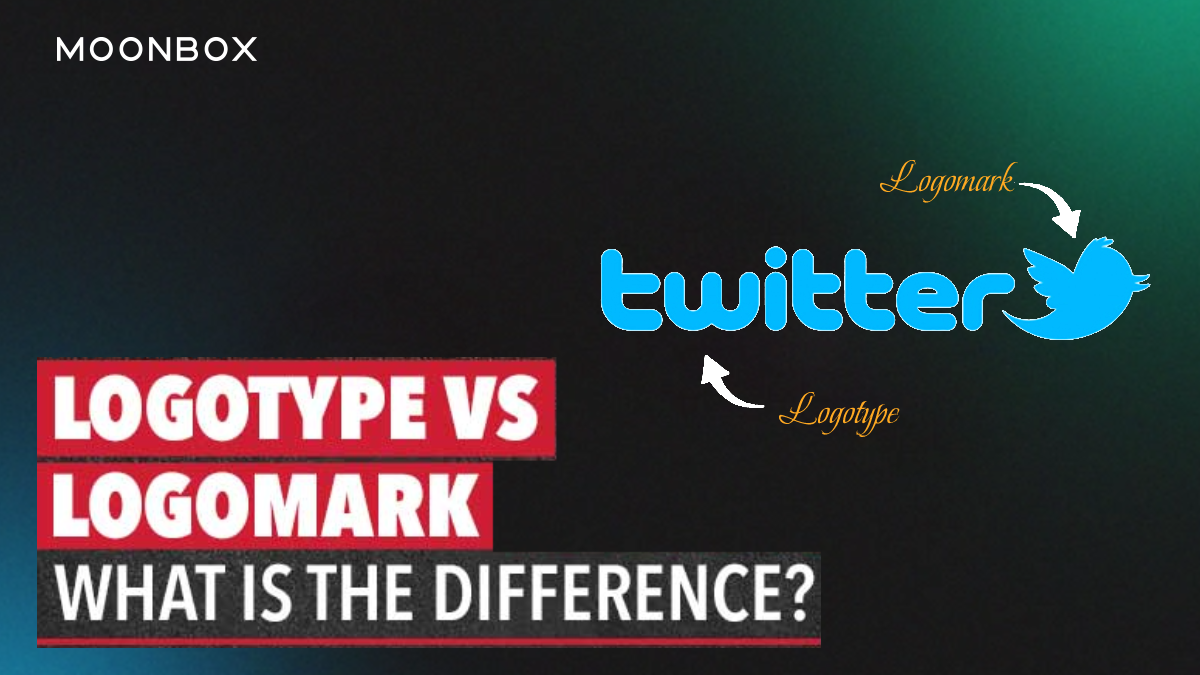
Logotypes are logos centered around the company name or initials, while logomarks are logos centered around symbols. A logo is a mark that represents a brand in general. Thus, when a designer asks whether you want a logotype or a logomark, they’re really asking if you want a text logo or a picture logo.
In addition to logotypes, logomarks can also be referred to as pictorial logos or logo symbols.
Visa, Coca Cola, or Google are examples of logotypes. A name can be designed with a picturesque or stylistic font, but at its core it’s just text.
Apple’s logo, Twitter’s bird or Target’s target are examples of logomarks (or pictorial marks).
The confusion arises when the lines between them blur. Many logos include both text and a picture. There are some logos that contain text that resembles a picture. It appears that logo trends favor experimental hybrids that cannot be categorised as either one or the other. Basically, there are three options. Rather than just logotype vs. logomark, it’s logotype vs. logomark vs. a combination.
In addition, companies are increasingly using more than one logo. It is becoming increasingly popular to have different logo variations depending on the location, which is known as variable or responsive logo design. One company might use a logotype on its email letterhead, a logomark on their mobile website, and a combination on a giant street billboard. With multiple logos, you can select the one that is best suited to each location.
To summarize, when you see “logotype,” think “text,” when you see “logomark,” think “picture,” and don’t forget that they can be combined. You can choose more than one logo, depending on where and how you plan to use it.
Let’s get into the nitty-gritty: pros and cons of each, which brands should use them, and how they should be designed.
Logotypes include text or letters, such as the company name, initials (monograms), or a person’s signature. Logotypes are associated with more traditional and formal approaches to branding, and tend to promote name recognition.
A logotype’s success depends on how well it matches the brand’s identity. Colorful, loopy cursive letters suggest a more casual and fun brand than bold, black letters.
Avoid thinking logotypes are “easier” than other options. They’re actually more difficult to design than logomarks: both require design choices such as composition, sizing, and color, but logotypes also require typography choices.
To be iconic, you must first have an icon. In the same way that stick figures depict people, logomarks depict concepts or ideals. A logomark can have a powerful impact on how people perceive your entire brand when used correctly.
Logomarks must make the most of visual communication, unlike logotypes. Different shapes convey different messages: circles convey playfulness and informality, while squares suggest stability and confidence. You can manipulate abstract shapes to create a unique visual for your brand. It also applies to colors, size, and negative space.
Alternatively, you can use a popular image to express your brand personality. Nothing says “wisdom” like an owl, or maybe you want to show your environmental sensibilities with Uprooted, below. With the freedom to use pictures, you can also convey what your business does with an illustration.
Read more on How Impactful Is Logo Design On Brand Recognition?
There are so many options when it comes to logos. You should pick a logo that perfectly represents who you are as a company. Do you need a logo but are not sure what type to choose?
Remember. Make sure you get your logo right, as it is your most important branding asset. Don’t worry if you lack design experience; hiring a professional designer is your insurance policy. Contact the MoonBox Logo Design team for your Future Collaboration.