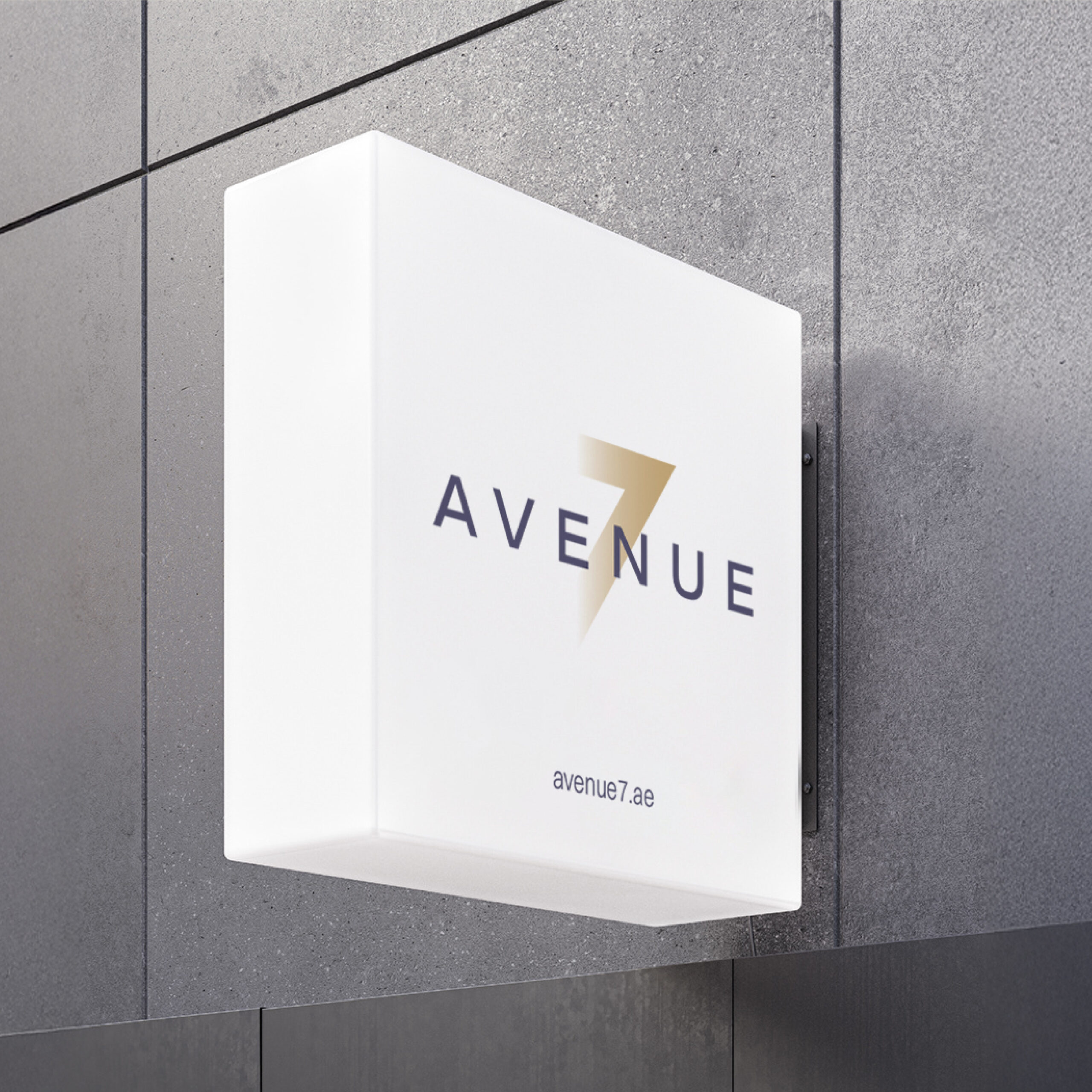
Little Clouds

Little Clouds, a new wet wipes product line under AKI (Al Khayat Investment), was developed to serve modern parents looking for baby-safe essentials that feel both trustworthy and premium. As a new entrant in a highly competitive FMCG category, the brand faced the challenge of building instant shelf recognition while communicating softness, safety, and reliability at first glance. With multiple wet wipes options often looking similar in-store, Little Clouds needed a logo and packaging system that would stand out quickly, feel contemporary, and create a strong emotional connection with parents.

Moonbox partnered with AKI to develop a complete logo identity and a series of distinct packaging designs that delivered high visual impact on retail shelves. The packaging system was designed to be eye-catching, easy to navigate, and clearly structured ensuring key product information remained visible while maintaining a soft, baby-friendly tone. With a fresh, new-age aesthetic and strong shelf presence, the final identity and packaging helped position Little Clouds as a modern, dependable wet wipes brand designed for today’s families.

Essenspice

Essenspice, a Saudi-based premium spice brand (evolving from Bahar Athwaq), was positioned to grow into a more refined, wellness-oriented, and luxury culinary offering that could appeal to both local and global audiences. As the brand expanded, it needed a stronger, more cohesive identity that could stand confidently in the premium market and communicate elegance, cultural depth, and product sophistication.

Moonbox supported Essenspice by developing a refreshed logo identity and a scalable packaging system that elevated the brand’s perception and improved consistency across touchpoints. We explored multiple logo directions, including refined wordmarks, a minimal E&S monogram, and premium symbolic approaches, before refining the final identity into a polished, high-end brand mark suited for premium packaging. The packaging design was crafted to align with the brand’s luxury positioning, ensuring the product felt modern, elegant, and shelf-ready while maintaining cultural integrity and a clean, minimal aesthetic.

Pinta

Pinta, a specialized interior and joinery-focused brand, required a clear, structured system to streamline how carpenters and consultants execute joinery work on-site. With multiple stakeholders involved in project delivery, the need was to create a practical tool that ensured consistency, reduced miscommunication, and aligned technical execution with the intended interior design direction. Moonbox developed the Pinta Joinery Box, a detailed and user-friendly kit designed to support both carpenters and consultants throughout the joinery process. The box includes standardized references, specifications, and guidance that simplify decision-making, improve accuracy in execution, and maintain design integrity. Built with a strong focus on interior application, the Joinery Box enables smoother coordination across teams, helping projects move faster with fewer revisions and clearer output expectations.

Claw Culture

Claw Culture set out to launch the first-of-its-kind claw machine room in Dubai, a vibrant, interactive space filled wall-to-wall with claw machines designed for all ages. To bring this playful concept to life, Moonbox was tasked with building a bold and engaging brand identity that could stand out in a highly visual, experience-driven market.

We developed a fun, energetic visual system rooted in arcade nostalgia and modern pop culture, from a custom wordmark and quirky iconography to a dynamic color palette and layered graphic patterns. The brand identity captures the joy of play, the thrill of winning, and the social buzz of shared experiences, helping Claw Culture position itself as a go-to destination for entertainment, content creation, and community engagement in Dubai.

Tera Power

TeraPOWERS, Aramco’s next-generation reservoir simulation engine, represents a leap forward in subsurface modeling, built entirely from scratch to deliver faster performance, greater fidelity, and unparalleled scale. To match the technical sophistication of the platform, Moonbox was tasked with developing a bold new identity that captured its power and innovation.

We crafted a modern visual system grounded in precision, clarity, and momentum, from a dynamic logomark inspired by data flow to a structured typographic system and a sleek digital-first palette. The branding unifies geology, physics, and supercomputing into one cohesive narrative, helping position TeraPOWERS not just as a tool, but as a transformational leap in Aramco’s digital capability.

Vivace

Vivace came to us with a vision to redefine modern luxury living, and we brought that vision to life through a complete brand transformation. We developed a refined visual identity rooted in timeless luxury and vibrant Italian elegance, along with a full verbal identity that captures Vivace’s soulful, intuitive, and welcoming voice. From tone of voice to narrative foundations, every element was crafted to reflect the brand’s purpose of creating a living symphony of comfort, belonging, and elevated experiences. We then consolidated this into comprehensive brand guidelines and a polished corporate profile, ensuring the brand is expressed with consistency, confidence, and emotional depth across every touchpoint.

With the strategic and creative groundwork complete, our partnership now moves into its next chapter – bringing Vivace’s world to life online. The website will translate the brand’s visual and verbal rhythm into a seamless digital experience, allowing guests to not only discover Vivace but feel its refined, soulful approach to luxury living.

Smoking beards

Smoking Beards is a bold, rebellious barbecue lifestyle brand evolving from a personal grilling identity into a full-fledged flavor movement rooted in fire, attitude, and community. Through our partnership, we helped define and articulate this transformation by building a strategic foundation and a strong verbal identity that amplifies the brand’s fearless personality. We refined their visual world, enhanced their brand assets, and crafted packaging and stationery systems that reflect their gritty, confident essence. 

Beyond branding, we developed a comprehensive social media strategy to establish Smoking Beards as the UAE’s go-to authority for BBQ culture – complete with content pillars, rollout phases, paid media structure, and a distinctive tone of voice. Our involvement extended into hands-on execution through social media management, content creation, and videography, ensuring the brand showed up consistently and powerfully across platforms. The result is a unified brand experience that fuels storytelling, community building, and long-term growth.

Overland

Overland is a well-established logistics and transportation company in Tanzania, known for its expanding fleet and growing regional presence. As the company continued to scale, it sought a refined and modernized brand identity that better reflected its ambitions and professional capabilities.

Moonbox led a complete rebranding exercise, starting with a refreshed logo that honored the brand’s legacy while introducing a more contemporary look. The work extended into comprehensive brand guidelines, updated stationery, and bold truck branding designed to enhance visibility on the road. Together, these deliverables created a cohesive and future-ready identity for Overland.

Manna Glass

Manna Glass, a premium provider of architectural glass solutions, sought to elevate its brand presence while preserving the recognition of its existing “M” symbol. With a reputation built on craftsmanship, technical expertise, and refined aesthetics, the brand needed an updated identity that felt more modern, polished, and aligned with its growing portfolio of residential and commercial projects.

Moonbox refined the logo system, expanded the color palette with richer blues, and developed cohesive brand guidelines covering typography, graphic elements, and art direction. The project also included crafting a clear verbal identity to unify the brand’s tone across communications, along with producing a corporate video that visually captured Manna’s precision, innovation, and commitment to quality. Together, these elements strengthened the brand’s presence across all touchpoints.

KAF

KAF is a UAE-born fresh produce company founded in 1968, trusted for sourcing and delivering high-quality fruits and vegetables with care and integrity. Recognized as a leading B2B wholesale and distribution partner, KAF continues to grow its legacy through stronger partnerships, traceability, and a future-facing vision to bring trusted freshness into homes. We helped KAF sharpen their market positioning and led a full rebrand, refreshing their identity, messaging, and visual system to create a consistent, modern brand experience across every touchpoint

icon