Categories
Blogs

Pamphlet vs Brochure: Understanding the Difference for Effective Marketing

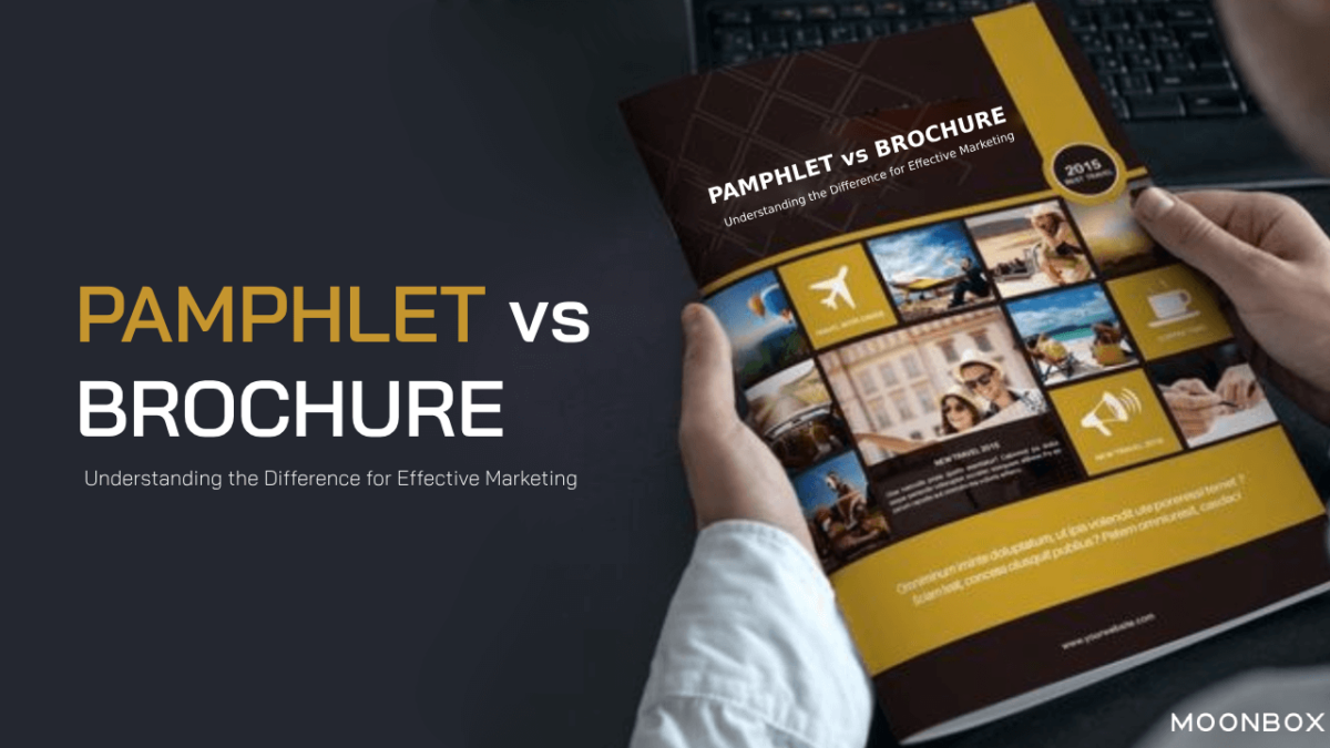
When you buy marketing or direct mail materials for your business or event, you know that each piece of print marketing material has a different term. Pamphlets and brochures are no exception. So whats the major difference between pamphlet vs brochure?

Many of our customers ask us what the real difference is between brochures and pamphlets. People often use these two words interchangeably when printing product or company information in a booklet format. There is only one difference between the two: their names. Pamphlets and brochures generally look similar, but there are some slight differences to note. For clarification, let’s define pamphlets and brochures further and provide a few examples of each. Here we will have a quick look into the difference between pamphlet vs brochure

Discover Exceptional Company Brochure Design Services at MoonBox

BROCHURES: WHAT ARE THEY?

The brochure is a single or multi-page folded paper that sells the products or services of a company.

There are several ways to fold and staple this piece of paper to create separate pages. Brochures are sometimes referred to as booklets. Despite looking similar to a pamphlet, brochures are more commonly used for advertising a company’s products or services. There are usually more images in brochures than words. Brochures can be used to introduce new products or describe service offerings to prospective customers.

Here is an overview of brochures:

  • Product/service advertising

  • Binding can sometimes be seen

  • Pages in multiples

PAMPHLETS – WHAT ARE THEY?

Pamphlets, by definition, are small booklets that advertise or provide information about a single topic.

Their primary purpose is to inform rather than to sell. The term “leaflet” is sometimes used to describe a pamphlet as well. Pages of pamphlets are stapled together or printed on both sides of one sheet and folded several times. Pamphlet designs can vary in shape, size, and number of pages. Some common uses for pamphlets include political campaigns, event promotion, and communicating organization information.

An overview of pamphlets:

  • Informational in nature

  • Format unbounded

  • A limited number of pages are available

SIZES OF PAMPHLETS & BROCHURES

A pamphlet or brochure’s size can be determined by the specific requirements and design preferences. There are, however, some common sizes for these print marketing materials. The following are a few standard brochure and pamphlet sizes:

PAMPHLET SIZES:

  1. Standard Letter Size (8.5″ x 11″):

    It provides ample space for text and images and is commonly used for pamphlets.

  2. Half-Letter Size (5.5″ x 8.5″):

    Distributing or carrying this size is convenient because it is smaller and more compact.

  3. DL Size (99mm x 210mm):

    Pamphlets in the DL size are popular because they are longer and narrower, allowing for unique layouts.

BROCHURE SIZES:

  1. Tri-Fold Brochure:

    A tri-fold brochure is typically 8.5″ x 11″. The document is folded into three panels, each measuring approximately 8.5″ x 3.66″.

  2. Bi-Fold Brochure:

    Typically, bi-fold brochures are 8.5″ x 11″ folded in half, resulting in four panels of approximately 5.5″ x 8.5″.

  3. Square Brochure:

    Square brochures come in various sizes, such as 6 inches by 6 inches, 8 inches by 8 inches, and 10 inches by 10 inches. An appealing and unique format is offered by these square dimensions.

Also read more on Innovative Brochure Design Ideas for a Stunning and Unique Marketing Collateral

Brochure vs Pamphlet – Whats the Difference?

so, what’s the difference between a pamphlet and a brochure? Here are the main points to discuss

  1. Companies use brochures to advertise and sell multiple products and to inform customers about discounts and offers. In contrast, a pamphlet’s aim is to inform readers about a particular topic or make them aware of a new product by describing its key features.

  2. Pamphlets are smaller than brochures, because they contain less but significant information on the subject matter. For creating pamphlets, companies typically use a single sheet of paper with two or three folds. The company may use more than one paper if they require so, however, brochures are large in size compared to business cards. Multiple pages are often bound together. All the main features of the company’s products are listed on these pages.

  3. What makes a pamphlet inexpensive? The answer is quite simple since pamphlets do not require special printing paper. In addition, it does not require any unique designs or images, so pricing and design costs are kept to a minimum. On the other hand, brochures are more expensive because they require glossy paper for printing. To make your patrons, i.e. your audience, like your content, you would need to add beautiful graphics and designs.

  4. It is well known that brochures are used to sell a company’s products, whereas pamphlets are used to inform or spread awareness about a specific subject.

  5. A pamphlet contains information, while a brochure contains promotional material.

WHERE CAN I GET A BROCHURE DESIGN SERVICES?

The Moonbox, of course! To ensure that your pamphlet or brochure is high quality and designed with all the correct information, we offer the best company brochure design services. To make your pamphlet or brochure look professional, we have a knowledgeable design team. Our mailing and logistics services ensure that your brochures or pamphlets are stored correctly and mailed on time.  Check out the Moonbox Design Services and request a quote 

Categories
Blogs

ADNOC Logo and Symbol, Meaning, History & Much More

What is ADNOC?

ADNOC ( The Abu Dhabi National Oil Company) is the biggest oil company in the United Arab Emirates. It is a government-owned company. In more than 50 years, it has developed into a commercially successful brand.

ADNOC Logo: what does it mean?

A business should also keep in mind that this bird symbolizes force and courage. The falcon’s claws were depicted in the original logo, with many details. There was a red flame in its chest, indicating that ADNOC was an energy company.

Moonbox, a premier Dubai-based logo design company and branding agency, excels in capturing wonder through a proven formula of storytelling and effective communication, elevating businesses to new heights.

The Meaning and History of the ADNOC Logo

ADNOC Logo Stages

An ADNOC logo has always featured a stylized falcon. There has, however, been a dramatic change in the appearance of the bird. From a cluttered design to a sleek modern logo, it has come a long way.

1971 – 1998

ADNOC 1971 - 1998

First of all, why did the company choose the falcon as its symbol? In order to understand this, it is important to remember that falcons are the national bird of the UAE. The company’s roots are emphasized by this choice, which is in some ways a tribute to the country. The company has always had national ambitions, as well.

Additionally, this bird represents strength and courage, which are important qualities for a business.

A falcon’s head claws were depicted in the original logo, along with plenty of details. In its chest, a red flame indicated that ADNOC was an energy company.

There was plenty of blank space above the bird’s head inside a rather large blue rectangle. The bird emblem became even more realistic when it symbolized the sky. The downside was that it didn’t work this way here and created the illusion that someone had forgotten to cut off the excess.

1998 – 2016

ADNOC-Logo

We can still see the blue “sky” in the second ADNOC logo, which looks like a piece of paper the designers forgot to remove.

However, the bird looks far more modern than it did in the previous version. Since only the head is left, the expression on the bird’s face is more prominent, so there are more emotions. Swooshes also create a dynamic style on the falcon. The flame is gone, but a red stroke remains on the bird’s chest.

Unlike the original logo, this one features the wordmark in blue. Since the emblem also lost black elements, the designer had to change the lettering’s color to match the simpler palette.

Bilingualism remains in the logo. The type in the English version of the wordmark is legible and retains its overall style. However, due to the disappearance of the unique strokes in the previous version, it’s lighter and more generic.

2016-Present

Adnoc Logo

ADNOC announced the adoption of a new logotype in November 2016. It is also simpler than its predecessor. By far, it looks sleeker and more effective.

The bird’s head now occupies most of the surface. This white box has blue details and is enclosed in a blue box. The box is a square instead of a rectangle like the previous logo. Therefore, there is no blank space. Thus, the emblem appears more proportionate and logical.

There is no longer a red swoosh on the falcon’s chest. As a result, flame symbolism is no longer present. However, the swoosh itself did not clearly refer to the flame. To understand its meaning, you had to compare it with the previous logos, while the 2016 version can be understood without knowing this allusion.

Warning : All logos are protected under international copyright laws and copyrighted to their respective owners. Any content may not be reproduced, distributed, published, transmitted, modified, or otherwise exploited without prior written permission.

Colors and font

The ADNOC logo has always been blue. There is a darker shade in the 2016 version. Partly due to the darker color and partly due to the larger glyphs, the wordmark is more legible.

Categories
Blogs

Sign Board Design Ideas To Inspire!

Check out today’s creative sign board design ideas for some inspiration for your next signage project. MoonBox has been in the customer sign industry for over 10 years and we’d love to share some of the unique ideas we’ve encountered! As most shoppers base their decisions and judgments on their first impressions, shopping centers are usually so attractive.  Therefore, what is the most important aspect of your shop front design?

It’s none other than your signboard! Your digital sign should not only display your brand and company name, but be so eye-catching that it practically stops traffic! 

We will discuss some innovative signboard design ideas here to attract attention to your small business

Top Creative Sign Board Design Ideas To Make Your Business Stand Out

Signboards are one of the most important elements of any business. When customers approach your office or store, it’s the first thing they see, and it’s an important first impression tool. It’s important to make sure your signboard stands out from the crowd with so many businesses competing for customers’ attention. To help you stand out from the crowd, we’ve compiled a list of creative signboard design ideas.

Using these creative signboard design ideas, you will be able to design a signboard that truly reflects your brand and captures the attention of potential customers. Here’s how you can make your signboard stand out from the crowd, regardless of the type of business you own or the type of marketing you are involved in.

Signboard Design Ideas for Inspiration

#1. Make use of unique shapes and materials

By using unique shapes and materials, your signboard will stand out from the crowd. Potential customers will immediately notice a signboard that is different from the typical rectangular or square shape. A circular or oval-shaped signboard can help your business stand out from the competition. You can also add a unique and modern touch to your signboard by using materials such as wood, metal, or even glass. By using these materials, you can create 3D or sculptural designs that add depth and dimension to your signboard.

Using different textures in your signboard design is another way to incorporate unique shapes and materials. A rough, rustic wood can give your signboard a natural and organic feel, while a smooth, glossy metal can give it a more contemporary feel. It is also possible to add depth and texture to your signboard by using lighting. Your brand can truly be represented by a signboard that is unique and one-of-a-kind when you experiment with different shapes, materials, and textures. These creative signboard design ideas will help you stand out from the crowd in a crowded market.

#2. Vibrant colors add a pop of color

Adding a pop of colour to your signboard is one of the easiest yet most effective ways to make it stand out. Black and white signboards or ones that blend in with their surroundings are unlikely to attract attention. By incorporating bold, bright colours into your signboard design, you can create an eye-catching visual.

There are several creative signboard design ideas you can use to add a pop of color to your signboard. Backgrounds or accents can be done with a single, bold color. It is also possible to use multiple colours in a pattern or design. Create a visually appealing signboard by using contrasting or complementary colors.

#3. Make use of graphic design elements

Signboards that stand out can be enhanced with graphic design elements. You can incorporate graphic design into your sign board design in a variety of ways, from typography to illustrations and icons. A simple way to accomplish this is to use bold, clean typography that is easy to read from a distance. It is possible to accomplish this by choosing a large font size and using a simple, sans-serif font. To create a sense of hierarchy and highlight key information, you may also want to consider different font styles.

You can also incorporate graphic design elements into your signboard by using illustrations or icons. By using these, you can create visual interest and communicate information more effectively.

Last but not least, you can use graphic design elements to create a sense of movement or dynamic on your signboard. Using diagonal lines or arrows can give the impression of movement, as can shapes that appear to move or change. Especially effective are signboards located in areas with a high foot traffic or those viewed from moving vehicles. Make sure the movement or dynamic elements you use are not too distracting or overwhelming, as this can make it difficult to read the signboard.

MoonBox: Setting the standard for the best graphic design services in Dubai with unmatched creativity and quality.

#4. Create a creative logo

Your logo is the most important part of your signboard. The first thing people notice about your business is the logo. That’s why your signboard needs a creative logo. When your logo is well-designed, it will leave a lasting impression on your customers and help them remember your brand

From Moonbox, you can get creative logo design services


Creative sign board design ideas are available for creating a creative logo for your signboard. Simple, clean designs are easy to read and easy to remember, for example. You could also use a more complex design that incorporates illustrations, typography, or graphics. Consider using a playful or quirky design that reflects your company’s personality.

Additionally, you might consider using different colours or shapes for your logo. You should keep in mind the overall aesthetic of your business and how the logo you choose will work together with the rest of your signboard to create a cohesive and memorable one.

#5. Lighting can enhance your signboard design

A signboard’s design can be enhanced by lighting. Signboards can be illuminated at night to create a specific mood, highlight certain elements, or make them more visible. Incorporating lighting into your signboard design can make it stand out and capture people’s attention.

To enhance your sign board design using lighting, you can use several creative sign board design ideas. With backlighting or spotlighting, you can create halo effects around your signboard. To create a specific mood or match the colors of your signboard, you could use different colors of light.

#6. Utilize limited space to the fullest extent possible

Small businesses and those with limited storefront space often face space constraints when designing signboards. By being creative, you can make the most of limited space and create a signboard that is both effective and appealing. Keeping your design simple and uncluttered is one of the best creative sign board design ideas.

 A signboard that has too much information is likely to be ignored by potential customers. Make use of simple, easy-to-read graphics and clear, concise language instead. Another creative signboard design idea is to use vertical space.

Additionally, neon lights or LED lights can also be used to create an eye-catching and energy-efficient signboard. You can use these lights to draw attention to your signboard at night and make it stand out. Using creative signboard design ideas like these can help you create a signboard that is both effective and visually appealing.

#7. Create dynamic signboard designs using technology

Businesses are constantly seeking new and innovative ways to stand out in today’s digital age. You can accomplish this by incorporating technology into your signboard design. You can create dynamic and interactive signboards that grab people’s attention and leave a lasting impression using technology. 

Final Words

For any business, a creative sign board design is essential. When customers approach your store or office, it’s the first thing they see, and it’s a powerful way to create a positive first impression. We’ve discussed creative signboard design ideas that businesses can use to make their signboard stand out from the crowd in this blog post. Make your business stand out with these ideas, whether you are a small business owner or a marketing professional.

Categories
Blogs

Is Michael Kors a Luxury Brand? : Unraveling the Luxury

As we go through life, we are going to need to make a lot of important decisions. There is nothing more exciting or less complicated than fashion decisions! Adding the right accessories to our outfit is always the key to making it stand out on a special occasion.

You may be considering getting yourself top luxury brands such as Louis Vuitton. Michael Kors’s collection might be of interest to you. In light of this, we must ask: Is Michael Kors a luxury brand?

Founded in the early eighties, Michael Kors is still a popular fashion designer. How does Michael Kors compare to legacy brands? Come on, let’s find out.

A popular designer brand in America, Michael Kors is known for its trendy handbags and watches, but is Michael Kors a luxury brand? See what you can discover out!

Fashion house Michael Kors sells its products in department stores and retail stores around the world. Known for its fashionable handbags, enchanting fashion collections, and smart watches, the brand has become a household name.

Considering the fact that Michael Kors catwalk shows are a key part of New York Fashion Week and the trendy, high-quality products they offer, some consider Michael Kors a luxury brand. Some critics, however, argue that this brand’s fabrics and price range are not as luxurious as well-established luxury brands like Louis Vuitton and Saint Laurent.

In order to settle this debate, we will examine Michael Kors’ history, quality, and some of its best-selling pieces before coming to a conclusion on the question, is Michael Kors a luxury brand?

Is Michael Kors A Luxury Brand?

An Overview of Michael Kors’ History

The MICHAEL KORS brand has been established by the award-winning American designer since the early 1980s when he cut his teeth creating eye-catching womenswear in New York City. Kors has always strived to align his ready-to-wear designs with his core values – think modern glamour with a sporty attitude -, and his company continues to lead the way. 

MICHAEL KORS’ history dates back to 1981, when the designer launched his first women’s line at Bergdorf Goodman. 

KORS Michael Kors was launched in 1990 as a licensed range. As Celine’s first woman’s ready-to-wear designer, Kors took on the role in 1997. The following year, he joined the original Michael Kors Collection by establishing MICHAEL Michael Kors, launching his own menswear line. Men’s and women’s watches were introduced by Michael Kors in 2004.From footwear to fragrances, each offering tells its own story of flourishing.

Moreover, MICHAEL KORS handbags have an impressive record, with fans across the globe seeking out their statement hardware. In addition, who could forget that iconic MICHAEL KORS logo, which has its own remarkable history dating back to 1981 with an encircled MK?

What about the price?

Some people believe MK products are overpriced, but many brands are as well. A certain product’s price is determined by the materials used, the design chosen, and the process by which it is made available for retail sale.

It is common for a product with a high demand to be expensive. Michael Kors’ quality and luxury status actually make it a pricey brand.

Michael Kors offers many different products, so let’s look at a few pieces that are known for the brand’s price range. Michael Kors handbags typically cost between $200 and $400, but some can cost as much as $1,610.

There are a variety of leather goods you can choose from, from wallets to coin purses to AirPods cases, that cost between $98 and $398. Depending on the size of the watch and the embellishments it has, Michael Kors watches can range from $250 to $595.

This brand’s dresses range from $125 to $695, tops from $40 to $225, jeans and pants from $68 to $495, and swimwear from $50 to $178. The price of a pair of shoes generally ranges from $45 to $250 – sandals and flip-flops are at the lower end, while leather boots are at the higher end.

Is Michael Kors a Luxury Brand?

Let’s take a look at the question,“Is Michael Kors a luxury brand?”

MK will be discussed in this blog post as a luxury or not. Do you ever ask yourself this question?

Are you considering getting a Michael Kors bag for yourself or someone you love, but are unsure if it’s luxury? We’ll see if it’s a luxury bag. Would it be worse to offer a bag that isn’t considered luxurious?

The materials they use for their products are the first thing to consider. You should know when buying a leather bag that it is of very high quality and can last you for many years, looking and working perfectly and just as new with proper care.

Furthermore, non-leather bags are also excellent for everyday use because they are constructed with high-quality assurance.

Aside from durability, Michael Kors offers a wide range of designs that appeal to a wide audience. Due to universally appealing designs and convenient accessories, such as adjustable or removable straps, there are bags for casual and formal occasions, and even those that work for both.

Michael Kors’ products are designed and made to fit the needs and lifestyles of their clients.

Michael Kors Branding – Marketing Strategy 

Michael Kors employs a variety of marketing tactics to reach their target audience and maintain their brand positioning.

  • Brand positioning and target audience: 

A luxury brand like Michael Kors appeals to people who value quality and high-end fashion, as far as brand positioning and target audience are concerned. Affluent and affluent people make up the majority of the target audience.

  • Unique selling proposition (USP):

The USP of Michael Kors is that it offers luxurious and sophisticated fashion at an affordable price. By offering quality and style at a reasonable price, the brand attracts customers who value quality and style.

  • Marketing channels and tactics:

In order to reach the target audience and promote their products, Michael Kors uses a variety of marketing channels and tactics. By partnering with influencers, hosting events, and having a strong social media presence, these strategies can be implemented.

  • Customer relationship management (CRM) and loyalty programs:

As part of its commitment to customer loyalty, Michael Kors engages with customers on a personal level as well. Using CRM tools like customer feedback surveys, email newsletters, and loyalty programs, they accomplish this.

The marketing strategy of Michael Kors has achieved its desired outcomes in general. Brands are able to reach their target audiences and maintain their brand positioning, increasing sales and customer loyalty.

In 2023, is Michael Kors popular? – Is MKF a good brand?

It is generally agreed that Michael Kors has enough history, characteristics, and processes to produce luxury brand products.

Although it is entry-level, consumers can benefit from it because it means competitive prices and further efforts by the brand to become a top luxury brand (like Louis Vuitton and Prada).

Despite future price increases, the overall value will remain high.

In other words, if you’re thinking about Michael Kors, now is the perfect time to check out the brand. It is possible that you will become more loyal to Michael Kors if you begin shopping here for Michael Kors.

Is Michael Kors a luxury brand? Yes, without a doubt! It may be entry-level, but it will be a luxury one!

MoonBox has established itself as the premier branding agency in Dubai through its unrivaled dedication to excellence and innovation. By consistently delivering exceptional branding solutions to a diverse clientele, MoonBox has showcased its profound understanding of market dynamics and consumer behavior. Their creative prowess, combined with a deep commitment to client satisfaction, sets them apart as the go-to agency for businesses seeking to elevate their brand presence and achieve remarkable success in today’s competitive landscape.

icon