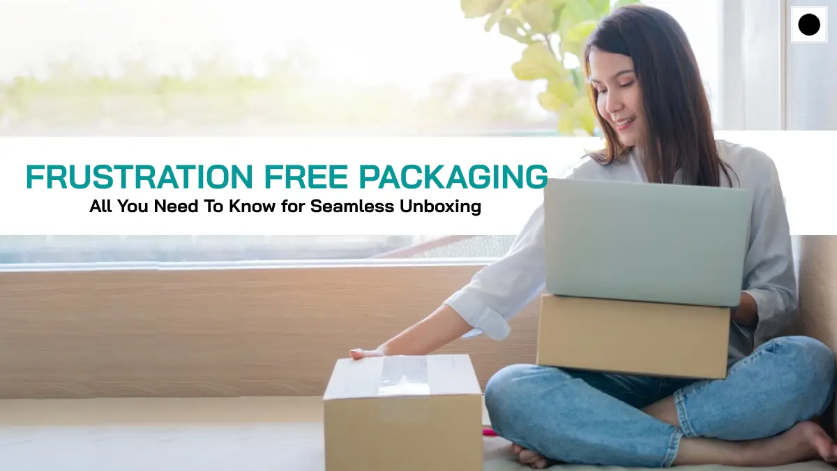
Frustration free packaging streamlines the unboxing experience, enhancing customer satisfaction by minimizing hassles, reducing waste, and delivering a seamless, user-friendly interaction.
What is Frustration Free Packaging?
Frustration free packaging (FFP) is a consumer-friendly and environmentally conscious approach to product packaging. It is designed to simplify the process of opening and using a product, minimizing the frustrations commonly associated with traditional packaging.
FFP prioritizes ease of opening, often incorporating features like tear strips, perforated lines, and user-friendly closures to eliminate the need for tools or excessive force. Moreover, frustration-free packaging aims to reduce environmental impact by using minimalistic designs that result in less waste. Clear instructions, simplicity in design, and a focus on enhancing the overall customer experience characterize frustration-free packaging, making it a win-win solution for both consumers and businesses.
Distinguishing Frustration Free Packaging from Standard Packaging
- User Experience:
- Frustration-Free Packaging: Prioritizes a positive user experience by incorporating easy-to-open designs, tear strips, and simplified closures, minimizing the need for tools or excessive force.
- Standard Packaging: Often involves more complex seals, multiple layers, and may require tools for opening, leading to a potentially frustrating unboxing experience for consumers.
- Environmental Impact:
- Frustration-Free Packaging: Emphasizes sustainability by using minimalistic designs, reducing packaging material, and minimizing waste, contributing to eco-friendly practices.
- Standard Packaging: Can be less environmentally friendly due to the use of excess materials, intricate designs, and a higher likelihood of generating more packaging waste.
- Packaging Design:
- Frustration Free Packaging: Characterized by simplicity, clear instructions, and a focus on minimizing unnecessary elements, contributing to a sleek and straightforward design.
- Standard Packaging: Often involves more elaborate designs, graphics, and additional features, which may contribute to a visually appealing presentation but can complicate the opening process.
- Cost and Efficiency:
- Frustration-Free Packaging: May result in cost savings for businesses due to reduced packaging materials, lower shipping costs (as a result of lighter packages), and potentially fewer returns related to damaged products during unboxing.
- Standard Packaging: May incur higher costs associated with materials, shipping, and potential returns due to a more intricate packaging design.
- Customer Satisfaction:
- Frustration Free Packaging: Aims to enhance customer satisfaction by prioritizing ease of use, reducing frustration during unboxing, and creating a positive overall impression.
- Standard Packaging: While it may offer aesthetic appeal, it could lead to customer dissatisfaction if the packaging proves challenging to open or results in excess waste.
What Factors Contribute to the Cost-Effectiveness of Frustration Free Packaging?
Several factors contribute to the cost-effectiveness of frustration-free packaging. Firstly, the streamlined design of frustration free packaging involves the use of fewer materials, reducing overall production costs. The simplified structure not only makes the packaging process more efficient but also minimizes waste, contributing to additional cost savings. Secondly, the lighter weight of frustration-free packages leads to lower shipping costs, benefiting both the manufacturer and the environment.
Additionally, the reduced likelihood of damaged products during shipping results in fewer returns, saving businesses on potential additional expenses. Altogether, the combination of minimalistic design, decreased material usage, and enhanced shipping efficiency positions frustration-free packaging as a cost-effective solution for businesses looking to optimize both their production and logistics processes.
Explore more on Food Packaging Design : A Complete Guide
Amazon Frustration Free Packaging
Since 2019, Amazon has been promoting its “Frustration-Free Packaging” initiative to its sellers. This program allows companies that sell their products via Amazon to qualify for a special packaging standard. Products that meet these criteria are shipped to customers with minimal packaging. The objectives of this program are to ensure that the packaging is sufficient to be sent directly without needing extra packaging materials, is user-friendly and easy to open, and is made from sustainable or recyclable materials.
Amazon’s frustration free program
We’ve all encountered the challenge of opening an over-secured package during our online shopping experiences, akin to a puzzle that would stump even Houdini. The frustration of seeing your purchased item trapped inside a fortress of tough plastic and wires can be quite infuriating. To address this, Amazon has introduced the Frustration Free Packaging (FFP) program, offering both sellers and customers a more convenient and user-friendly packaging solution.
Frustration Free Packaging by FBA
The Frustration Free Packaging (FFP) program, distinct from conventional packaging, is tailored specifically for e-commerce shipping. It focuses on protecting the product while ensuring that the packaging is straightforward to open. With FFP, you often only need to open the Amazon box, and perhaps an additional smaller box for minor components, before the product is ready for use.
This streamlined approach not only enhances the customer experience but also significantly cuts down on packaging waste. An extra perk of the FFP program is that it employs 100% recyclable packing materials, so by using it, you’re benefiting both yourself and the environment.
Winding Up
Using Frustration-Free Packaging is an effective strategy to avoid “wrap rage” among your customers, leading to their increased satisfaction. This, in turn, often results in more positive seller feedback and product reviews. Enhanced reviews and feedback significantly boost your likelihood of securing the coveted Buy Box on Amazon. Therefore, by opting for Frustration-Free Packaging, Small & Light, or any similar seller programs, you’re not only aiding the environment and pleasing your customers but also giving your own business a boost. It’s a win-win situation for everyone involved.
MoonBox, a premier packaging design firm based in Dubai, UAE, specializes in crafting distinctive and eye-catching packaging designs. Their expertise lies in making products stand out and effectively conveying their value to customers. For a range of branding services including packaging design, brochure creation, logo development, and more, consider reaching out to Team MoonBox, a leading branding agency in Dubai.