Categories
Blogs

Brand Elements that Are Essential for Creating a Cohesive Identity

Logos are often confused with brands when referred to as brands. Logos are only one of the elements that make up a brand. In order to better understand what a brand means, let’s dig deeper.

A cohesive brand identity and recognition in the marketplace require branded elements that appeal to customers’ every sense. In the long run, this will lead to strong and lasting brand loyalty from your customers.

Read more on What is Brand Identity?

Brand identity consists of the following elements:

  1. Name

  2. Logo

  3. Color

  4. Slogan

  5. Image

  6. Shape

  7. Graphics

  8. Typography

TIP: Hire the best branding agency in Dubai to ensure your brand identity is flawless.

Brand elements that are essential

  • Brand Name

There is a spoken element to a brand called a brand name. A phrase, letter, number, or word can be included. As an example:

  • Pepsi

  • 7Up

  • Reebok

The process of naming a brand can be quite challenging, and the process of changing its name can be even more challenging. Finding a name that is unique, catchy, and reflects the soul of your brand takes time and effort. A brand name should therefore be thoroughly researched and examined before it is approved.
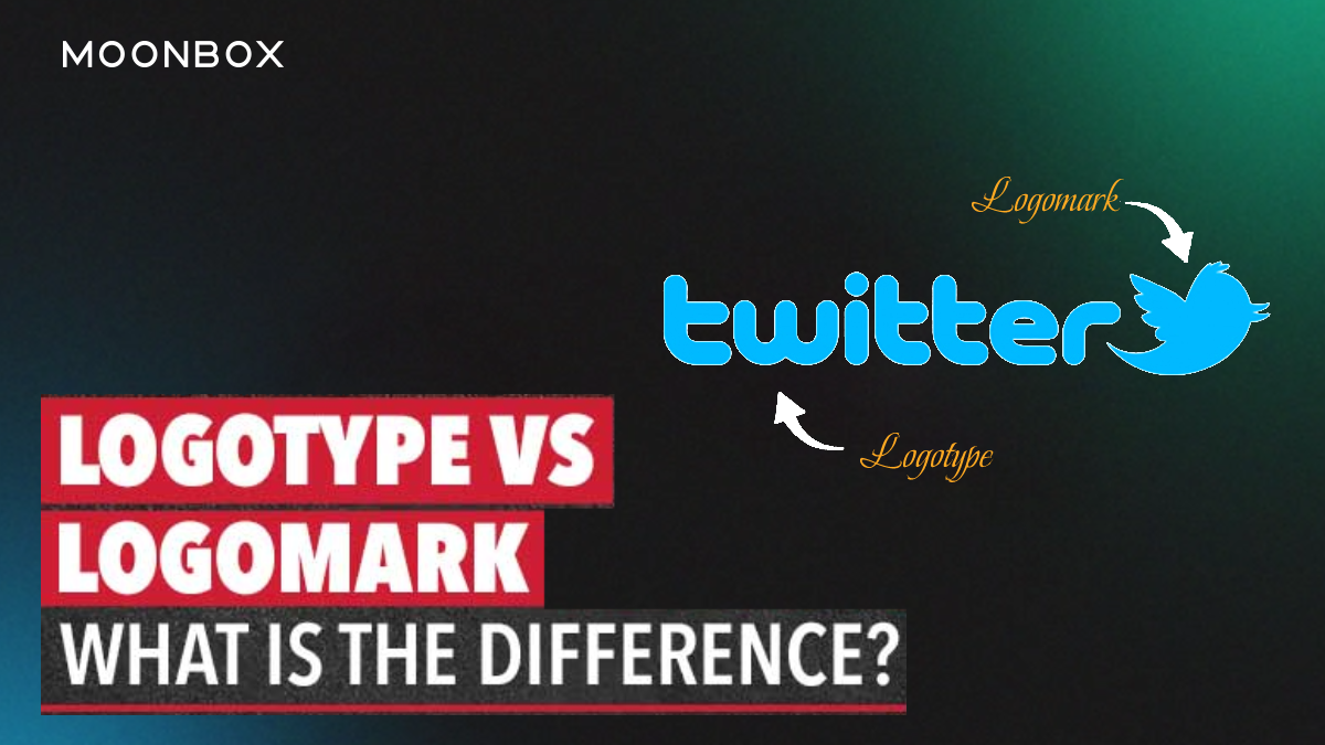
  • Logo/mark

The logo of a brand is also known as the brand’s mark. A brand’s visual elements. Symbols and signs can be used to identify a product or service. As for the definition, a logo can be a trademark or an abstract design, such as Rolex Crown.

  • URL

It’s also known as a web address or a uniform resource locator. Typically, it is based on what your company is about or its name in order to link your company with online content.

Companies look for a space on the web that suits their brand names based on the definition. Due to the rapid growth in URLs, this is not an easy task.

By using URLs, a brand’s recall can be enhanced. Strong brands use their literal name as their main URL. Customers can easily find the brand on the web this way.

  • Character

It is a colorful and imaginary symbol that takes on characteristics of a human being. There are two types of brand characters: animated characters like Chester Cheetah and live-action figures like Ronald McDonald. Ads usually feature these characters.

Brand characters increase brand awareness since they are catchy and attention-grabbing. Additionally, they show the fun side of the brand, which enhances its likability and acceptance.

  • Slogan

It is a phrase or tagline that expresses your brand’s vibe. A brand’s positioning is reinforced by communicating information about the brand in a persuasive or descriptive manner. In most cases, companies carefully choose their slogans because they must reflect their company’s image.

  • Jingles

Brand jingles are usually referred to as the sound of a brand. A professional songwriter composes a short musical message about a branded product or service. These jingles are meant to communicate brand meanings and benefits indirectly so that people feel a certain way about the product or service.

Furthermore, it helps increase brand awareness by mentioning the brand name multiple times, which makes encoding the needed messages easier.

The McDonald’s jingle “I’m lovin’ it has been stuck in people’s heads for a long time. McDonald’s has succeeded in influencing people’s thoughts and actions thanks to this.

  • Packaging

Brand packaging involves designing wrappers or packages for a product. It’s important for marketers to pick the right functional components for their packaging. Along with the innovative criteria needed to choose catchy colors.

 Conclusion

All of the brand elements work together to create a brand identity. It’s crucial for creating brand awareness. The elements of a brand are selected so that they align with each other and contribute to the overall image of the brand.

Categories
Blogs

LogoType vs Logomark – Key Differences Explained for Branding

Logotype vs Logomark-Key Differences

Logotypes are logos centered around the company name or initials, while logomarks are logos centered around symbols. A logo is a mark that represents a brand in general. Thus, when a designer asks whether you want a logotype or a logomark, they’re really asking if you want a text logo or a picture logo.

In addition to logotypes, logomarks can also be referred to as pictorial logos or logo symbols.

Visa, Coca Cola, or Google are examples of logotypes. A name can be designed with a picturesque or stylistic font, but at its core it’s just text.

Apple’s logo, Twitter’s bird or Target’s target are examples of logomarks (or pictorial marks).

The confusion arises when the lines between them blur. Many logos include both text and a picture. There are some logos that contain text that resembles a picture. It appears that logo trends favor experimental hybrids that cannot be categorised as either one or the other. Basically, there are three options. Rather than just logotype vs. logomark, it’s logotype vs. logomark vs. a combination.

In addition, companies are increasingly using more than one logo. It is becoming increasingly popular to have different logo variations depending on the location, which is known as variable or responsive logo design. One company might use a logotype on its email letterhead, a logomark on their mobile website, and a combination on a giant street billboard. With multiple logos, you can select the one that is best suited to each location.

To summarize, when you see “logotype,” think “text,” when you see “logomark,” think “picture,” and don’t forget that they can be combined. You can choose more than one logo, depending on where and how you plan to use it.

Let’s get into the nitty-gritty: pros and cons of each, which brands should use them, and how they should be designed.

What is a Logotype?

Logotypes include text or letters, such as the company name, initials (monograms), or a person’s signature. Logotypes are associated with more traditional and formal approaches to branding, and tend to promote name recognition.

A logotype’s success depends on how well it matches the brand’s identity. Colorful, loopy cursive letters suggest a more casual and fun brand than bold, black letters.

Avoid thinking logotypes are “easier” than other options. They’re actually more difficult to design than logomarks: both require design choices such as composition, sizing, and color, but logotypes also require typography choices.

The Pros of Logotypes:

  • Make sure you are going for a traditional and classic look (be sure that’s the look you’re going for)
  • Suitable for recognizing names
  • A great way to raise brand awareness
  • Provides an opportunity for puns and wordplay
  • Provides information about the company
  • There is no risk of confusion between brands

The Cons of Logotypes:

  • Logomarks tend to be more compact and don’t fit every location
  • There are fewer creative options; they aren’t as “fun” as logomarks
  • It doesn’t work well for brand names that are long or hard to pronounce
  • There are some letters that offer more artistic opportunities than others
  • In a few years, stagnant logotypes may appear dated due to font trends

For Which Brands are Logotypes Recommended?

  • Brands that want their names to be known
  • An indication of what the brand does can be found in its name
  • Logos that incorporate a slogan
  • Formal industries such as finance and law have strong brands
  • Brands looking to leverage a famous name
  • Taking a sophisticated or historical approach to branding

What is a Logomark?

To be iconic, you must first have an icon. In the same way that stick figures depict people, logomarks depict concepts or ideals. A logomark can have a powerful impact on how people perceive your entire brand when used correctly.

Logomarks must make the most of visual communication, unlike logotypes. Different shapes convey different messages: circles convey playfulness and informality, while squares suggest stability and confidence. You can manipulate abstract shapes to create a unique visual for your brand. It also applies to colors, size, and negative space.

Alternatively, you can use a popular image to express your brand personality. Nothing says “wisdom” like an owl, or maybe you want to show your environmental sensibilities with Uprooted, below. With the freedom to use pictures, you can also convey what your business does with an illustration.

The Pros of Logomarks:

  • Personalized and unique (if well designed)
  • Creativity unbridled
  • Using the right image can capture and convey complex ideas – a picture is worth a thousand words
  • Flexibility in how it can be used; great for displaying various aspects of a brand
  • It can be enlarged or compressed to fit a variety of spaces

The Cons of Using a Logomark:

  • Brand recognition for new brands can be slowed down
  • To achieve the full effect, graphic design expertise is required
  • Risks creating an emblem that looks too similar to another logomark

For Which Brands are Logomarks Recommended?

  • There are several companies whose names are objects or animals, such as Apple’s apple, Shell’s shell, and Penguin’s penguin
  • A radical rebranding is needed by emerging brands
  • An image of a logomark can demonstrate a company’s service or product
  • An icon or symbol that represents your brand identity already exists, such as scales of justice for a law firm.

Read more on How Impactful Is Logo Design On Brand Recognition?

Choose a Logo That Fits Your Brand

There are so many options when it comes to logos. You should pick a logo that perfectly represents who you are as a company. Do you need a logo but are not sure what type to choose?

Remember. Make sure you get your logo right, as it is your most important branding asset. Don’t worry if you lack design experience; hiring a professional designer is your insurance policy. Contact the MoonBox Logo Design team for your Future Collaboration.


icon