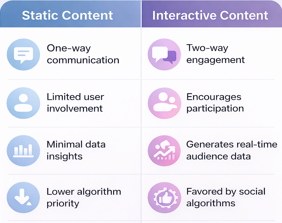
For many years, brands have been relying heavily on static posts like single images, generic captions, and occasional promotional graphics. While this approach once provided reasonable engagement, the social media landscape in 2026 looks dramatically different.
Today’s users are scrolling faster, expecting personalization, and demanding experiences rather than passive consumption. Attention spans are shorter, algorithms are smarter, and competition for visibility is intense. As a result, static-only social media content is no longer enough to capture interest or drive meaningful engagement.
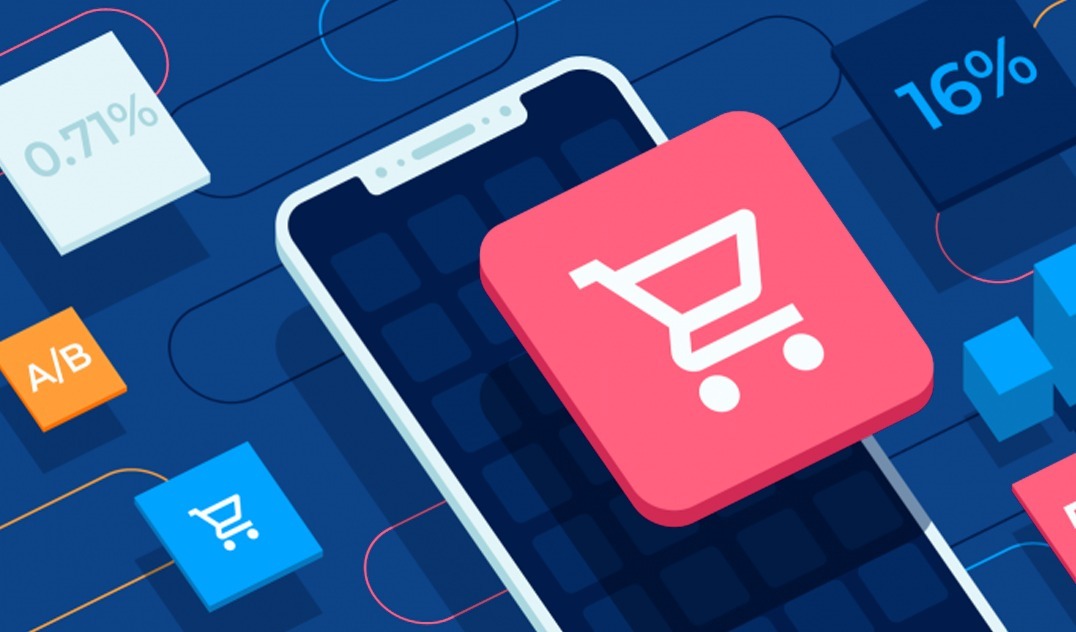
This shift has been paving the way for interactive social media content, which encourages participation, creates two-way communication, and provides valuable insights into user behavior. In 2026, brands that are adopting interactive formats are seeing significantly higher engagement, stronger customer relationships, and better conversion outcomes. In 2026, interactive social media content is not just increasing engagement; it is significantly boosting reach, saves, and conversion rates across platforms.
What Is Social Media Content in 2026?
Modern social media content can go far beyond simple visuals and captions, especially with the rise of AI-driven content creation.
Static vs Interactive Content
Examples of Interactive Social Media Content
In 2026, the most effective formats include:
- Polls and quizzes on stories
- Interactive sliders and reaction tools
- Gamified social posts
- AR filters and immersive effects
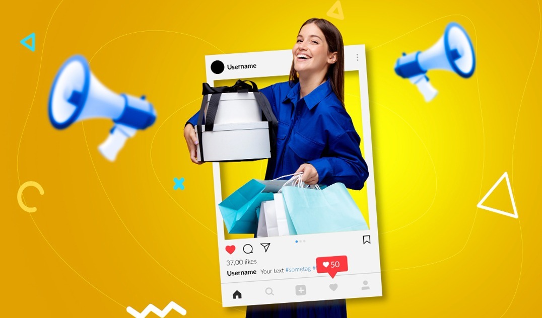
- User-generated content campaigns
- Interactive reels and shoppable videos
- Stories with clickable CTAs such as “Swipe Up,” “Vote Now,” or “Shop Here.”
- Short-form interactive video content like reels and TikTok-style formats
These formats transform audiences from passive viewers into active participants, which is exactly what social platforms reward today.
Why Interactive Social Media Content Is Winning in 2026
Interactive formats are not just trends; they provide measurable business results similar to well-planned social media campaigns.
Higher Engagement and Dwell Time: Interactive content can keep users involved and engaged for longer periods of time. If answering a poll or exploring an AR filter, users can spend more time interacting, which signals value to platform algorithms.
Better Data Collection: Interactive formats provide valuable first-party data such as preferences, opinions, and behavioral patterns. This can help brands to refine their targeting and personalize future campaigns.
Stronger Conversions and ROI: Engagement can naturally lead to higher conversion rates. Interactive content provides trust, encourages decision-making, and guides users through the customer journey more effectively.
Algorithm Preference: Social media algorithms prioritize content that sparks engagement. Interactive posts can generate more likes, shares, comments, and clicks, which can increase organic reach.
Increased Shareability and Virality: Participatory content is inherently more shareable. Users really love sharing quizzes, challenges, and interactive experiences with their networks, boosting brand visibility.
More importantly, interactive formats transform social media from one-way broadcasting into two-way conversations, where users actively participate instead of passively consuming content.
Key Elements of a Strong Social Media Content Strategy
A successful social media content strategy in 2026 focuses on more than just posting regularly. It requires thoughtful planning and alignment with business goals.
Key elements include:
Clear Business Objectives: Every piece of content should support a specific goal, be it brand awareness, lead generation, or customer retention.
Platform-Specific Planning: Different platforms need different formats. Interactive reels may work well on Instagram, while polls and discussion threads perform better on LinkedIn.
Consistent Brand Voice: Maintaining a recognizable brand tone and visual identity can build trust and also strengthen brand recall.
Balanced Content Mix: A strong strategy includes:
- Educational content
- Engagement-driven posts
- Conversion-focused campaigns
- Performance Tracking: Data analytics has a crucial role in tracking engagement rates, click-throughs, and audience behavior, which can help refine future content decisions.
How to Build a Winning Social Media Content Plan
Creating a high-performing social media content plan needs a structured approach. Include a balanced mix of static posts, interactive content, and short-form video formats.
Step 1: Develop a Content Calendar
Plan posts in advance to maintain consistency while allowing flexibility for trending topics.
Step 2: Diversify Content Formats
Avoid relying on a single format. Include videos, polls, interactive stories, and user-generated content.
Step 3: Optimize Posting Frequency and Timing
Analyze audience activity patterns to determine the best times to publish content.
Step 4: Study Audience Behavior
Use analytics tools to understand what types of content your audience prefers and engages with most.
Step 5: Monitor Trends Continuously
Social media trends evolve rapidly. Staying updated ensures your strategy remains relevant.
Things to Consider When Creating Social Media Content
When developing modern social media content, brands should focus on quality, relevance, and engagement potential. Brands should also adapt content based on platform behavior, as audiences engage differently on Instagram, LinkedIn, TikTok, and Facebook.
Audience Intent: Understand why your audience follows your brand and customize content accordingly.
Visual Storytelling: Compelling visuals, along with a strong narrative, can increase emotional connection.
Clear Calls to Action: Encourage users to take a specific action, like participating in polls, exploring product links, etc.
Consistency Without Fatigue: Maintain regular posting schedules without overwhelming your audience.
Data-Driven Optimization: Continuously analyze performance metrics and adjust strategies accordingly.
Promotion Budget Planning: Allocate resources for boosting high-performance content to maximize reach.
Social Media Content Promotion: Posting Isn’t Enough
In 2026, organic reach alone cannot guarantee visibility. Effective social media content promotion is also essential.
Limited Organic Reach
Algorithms prioritize paid and highly engaging content, making organic reach increasingly competitive.
Boosting High-Performing Posts
Promoting posts that are already showing strong engagement can improve ROI and visibility.
Paid and Organic Integration
Combining organic content strategies with paid promotions can make broader audience coverage.
Retargeting Strategies
Using audience data for retargeting can help convert users who previously interacted with your content.
How Moonbox Helps Brands Win on Social Media
What sets Moonbox apart is how it shapes smart social media strategies built for a world that moves quickly online. Instead of just sharing updates, they blend careful planning with fresh ideas to lift brands past routine uploads. Real connections form – not likes or shares – and those interactions quietly push results that matter most.
What stands out about Moonbox is how it builds strategies using real-time data. Instead of guessing, they rely on insights drawn from audience behavior and measurable results. These details shape content that fits exactly what a company needs right now. Often, that means boosting recognition, pulling in new leads, or strengthening existing customer ties.
What stands out about Moonbox is how it builds experiences around interaction first. Instead of focusing on static views, the team leans into formats where people join in – not just watch. Think puzzle-style campaigns that spark competition, or tales shaped by audience choices, for example. Even when creating shared moments online, the work leans toward depth over distance. Engagement becomes less about entry, more about staying involved.
Beyond that, Moonbox brings know-how tied to individual platforms – shaping content ways that fit how each social space works. Because it adapts, not copies, the method fits distinct habits in posting, scrolling, and sharing across apps. That fit tends to push results further in visibility, interaction, and outcome.
Right from the start – with planning and creative work – Moonbox handles every step needed to bring ideas to life. When it comes to putting things into action, sharing results, and then refining them, the company provides full coverage for social media content. Because of this depth, brands counting on solid performance turn to Moonbox as a reliable ally during today’s interactive content shift.
Adapt or Get Left Behind
The era of static-only posting has come to an end. In 2026, interactive experiences define successful social media content strategy and drive meaningful brand engagement.
Brands that are invested in interactive formats can benefit from stronger relationships, valuable audience insights, and higher conversion rates. Those that fail to adapt risk losing visibility in an increasingly competitive digital landscape.
The future of social media belongs to brands that create experiences — not just posts.
Ready to upgrade your social media content strategy? Talk to Moonbox about interactive social media content that converts.
FAQs
- What is interactive social media content?
It is content that is designed to encourage active user participation rather than passive viewing. It can include formats like polls, quizzes, interactive stories, sliders, AR filters, gamified posts, and shoppable videos. This type of content can increase engagement, improve audience insight, and strengthen brand interaction.
- Why is interactive content important for social media in 2026?
Interactive content is crucial in 2026 because it can drive higher engagement, capture user attention for longer periods, and also provide valuable first-party data. Social media algorithms also prioritize content that generates interaction, making interactive posts more visible and effective than static ones.
- What are the examples of interactive social media content?
Common examples of interactive social media content include polls, quizzes, question stickers, interactive reels, AR filters, gamified contests, user-generated campaigns, and clickable stories. These can encourage users to participate and improve audience engagement.
- How can interactive content improve social media performance?
Social media performance can be increased by engagement rates, boosting dwell time, generating audience insights, and enhancing algorithm visibility. This can lead to stronger reach, better brand recall, and higher conversion potential.
- How can businesses create an effective social media content strategy?
Businesses can create effective social media content strategies by setting clearer goals, understanding audience behavior, using a mix of interactive and educational content, maintaining consistent branding, and regularly tracking performance metrics to optimize results.