Delali is a brand rooted in a dynamic and evolving market, but its existing identity no longer reflected its growth, positioning, and future direction. Over time, the brand lacked consistency and clarity across its visual and communication touchpoints, making it difficult to establish a strong and recognizable presence. The objective was to reimagine the brand in a way that felt more contemporary, distinctive, and aligned with its ambitions.
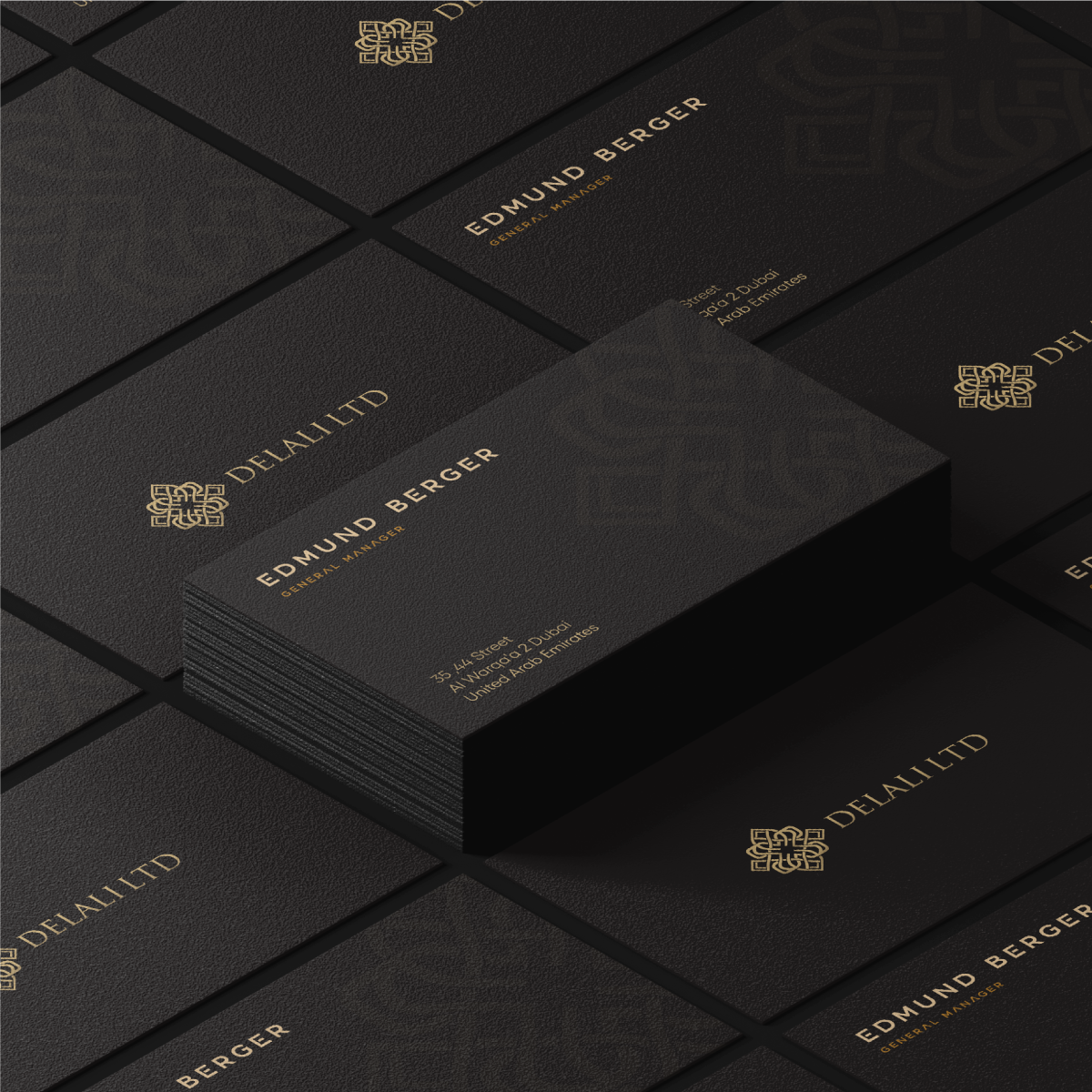
Moonbox led Delali through a comprehensive rebranding process focused on redefining its visual identity and strengthening its overall brand presence. This included the development of a refreshed logo, a cohesive visual language, and detailed brand guidelines to ensure consistency across all applications. The result is a more refined and confident brand that communicates with clarity, stands out within its category, and is built to scale across both digital and physical platforms.